I was happy with the image I created for Assignment 4 , and very pleased with the positive feedback , I am still very much a novice at Photoshop manipulation. However one of the things Russell pointed out to me to consider further is the font and composition. As the font is an integral part of the image Russell felt it was the wrong size (too small) and perhaps in the wrong place(my son-in-law had made the same comments). I had not really given as much consideration to the text , I was primarily more interested in actually blending the 2 images , than bearing in mind the title was also an integral part of the composition. Altering the size and position of the font will have an effect on the composition and Russell has made some suggestions for me to try. The blending modes , masking and tonal balance work well but Russell also suggests reducing the opacity on the lower part of the face.
Version 2
The Gunwalloe Ghost.
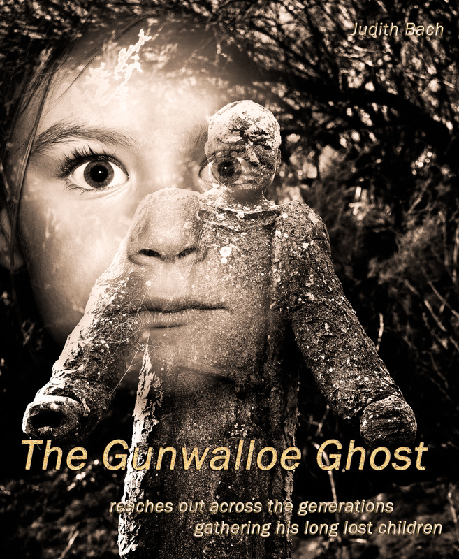
As I mentioned I am not that skilled using PS so this was quite a challenge for me. I had saved the original Gunwalloe Ghost as a Tiff file with the layers preserved so I was able to easily open the file again, add new adjustment layers, re-adjust and then save as a new Tiff file. Saving this 2nd image with the layers preserved meant I was able to keep going doing a bit of work on it , take a break ,then go back to where I left off. The only problem being these create quite big files , but at the moment I have lots of space on my hard-drive and back- up drive. I re-positioned the child to the top left hand corner of the cover using the move tool (Command + M ) as suggested by Russell. I re-positioned the text , increasing the font size. For the title I decided I needed to make it a lot more prominent and played around with the blend modes , I hope I have not gone over the top , son-in-law warned me not too, but I think the bolder title works reasonable well.
Version 2
The Gunwalloe Ghost.
As I mentioned I am not that skilled using PS so this was quite a challenge for me. I had saved the original Gunwalloe Ghost as a Tiff file with the layers preserved so I was able to easily open the file again, add new adjustment layers, re-adjust and then save as a new Tiff file. Saving this 2nd image with the layers preserved meant I was able to keep going doing a bit of work on it , take a break ,then go back to where I left off. The only problem being these create quite big files , but at the moment I have lots of space on my hard-drive and back- up drive. I re-positioned the child to the top left hand corner of the cover using the move tool (Command + M ) as suggested by Russell. I re-positioned the text , increasing the font size. For the title I decided I needed to make it a lot more prominent and played around with the blend modes , I hope I have not gone over the top , son-in-law warned me not too, but I think the bolder title works reasonable well.
I kept the remaining text on the bottom of the book cover slightly smaller but still more prominent than in my original version, and again tried different blending options. I used the same blending mode for my name which I have now placed at the top.
I tried placing the title in 2 different positions, I am really unsure which I prefer. I will print both versions , I prefer to actually study the prints over a couple of days rather that keep comparing on my computer screen.
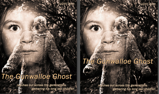
Using a layer mask I blended the 2 images, this is the most time consuming task and one I needed to keep returning too over a few days until I was happy with the result. Using a layer mask I blended the 2 images again ( this is a time consuming task ) and one I needed to keep returning too over a few days until I was happy with the result. Russell made some recommendations regarding the opacity of the 2 figures , I am not too confident that I have achieved what he suggested. Re-positioning the child made my choice of how to blend and merge the 2 images slightly different than my original version.
 RSS Feed