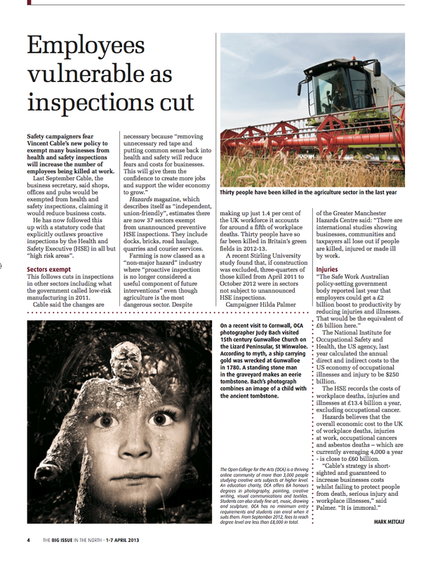
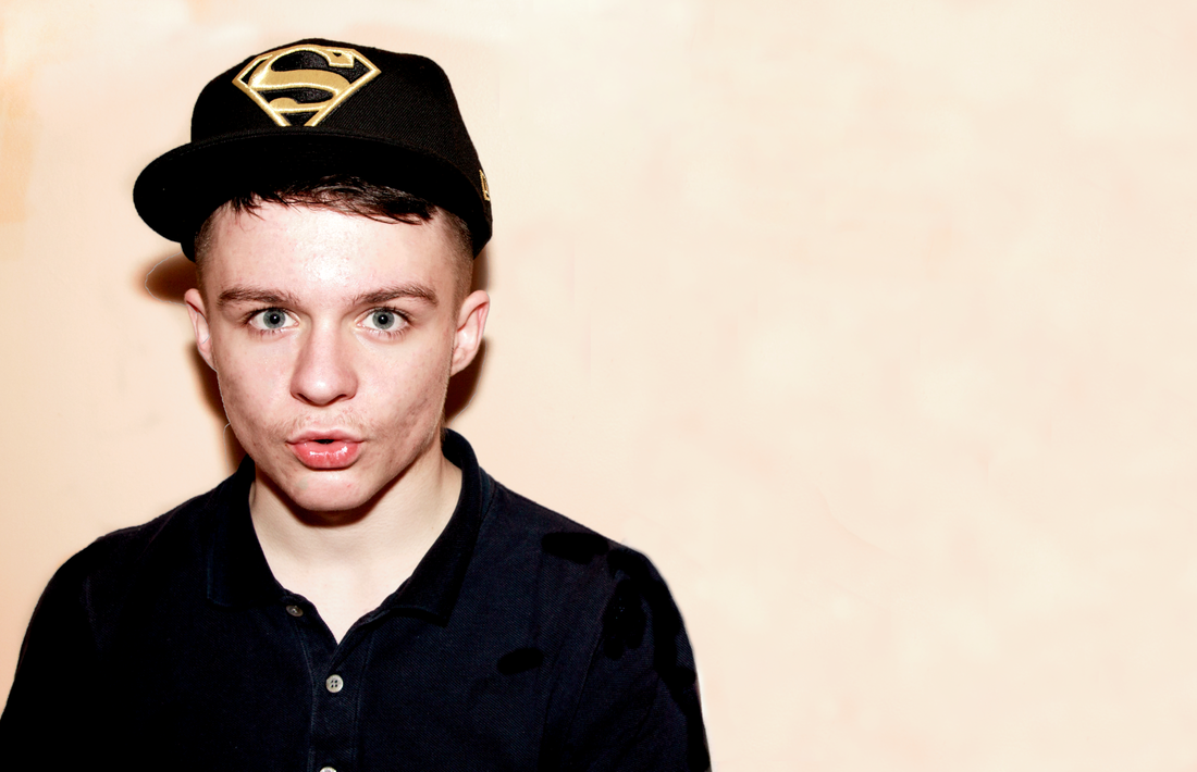
I am thrilled to have had my Assignment 4 image (minus the text) chosen to appear in an edition of The Big Issue in the North.
Big Issue in the North and the OCA have a collaboration whereby OCA student photographs are featured in the magazine. Work is selected from the OCA Flickr group pool and with the students permission is offered to the editor. I had an email from Elizabeth on behalf of the OCA a few weeks ago asking for my permission to send a copy of my image to the editor. After a few trials and tribulations using my Mac, which for some strange reason will not let me attach a full size jpeg with my Yahoo mail , I finally managed to send a full size copy via Dropbox to Elizabeth. The editor liked the image but wanted to use it without the text , which is fine by me.
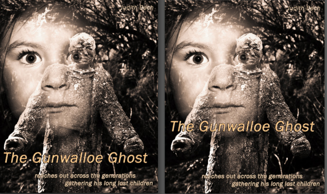
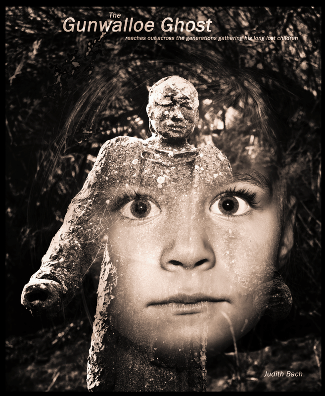
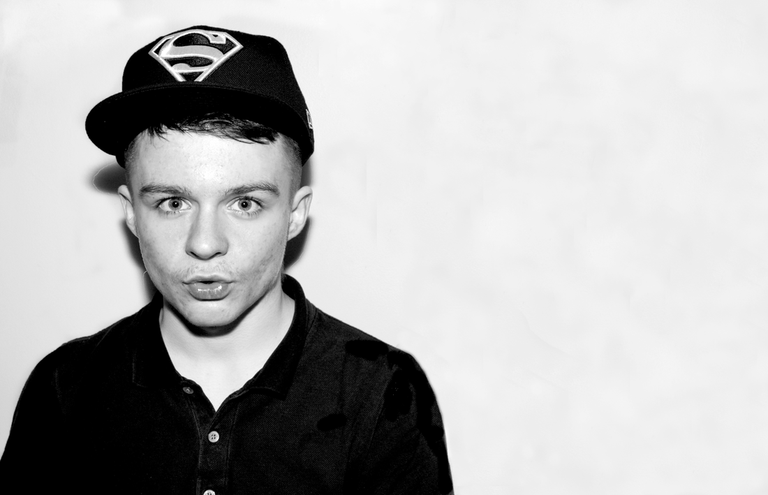
I was happy with the image I created for Assignment 4 , and very pleased with the positive feedback , I am still very much a novice at Photoshop manipulation. However one of the things Russell pointed out to me to consider further is the font and composition. As the font is an integral part of the image Russell felt it was the wrong size (too small) and perhaps in the wrong place(my son-in-law had made the same comments). I had not really given as much consideration to the text , I was primarily more interested in actually blending the 2 images , than bearing in mind the title was also an integral part of the composition. Altering the size and position of the font will have an effect on the composition and Russell has made some suggestions for me to try. The blending modes , masking and tonal balance work well but Russell also suggests reducing the opacity on the lower part of the face.
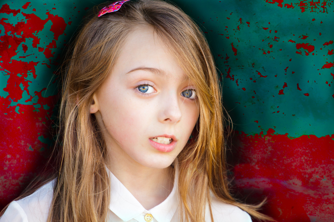
Version 2
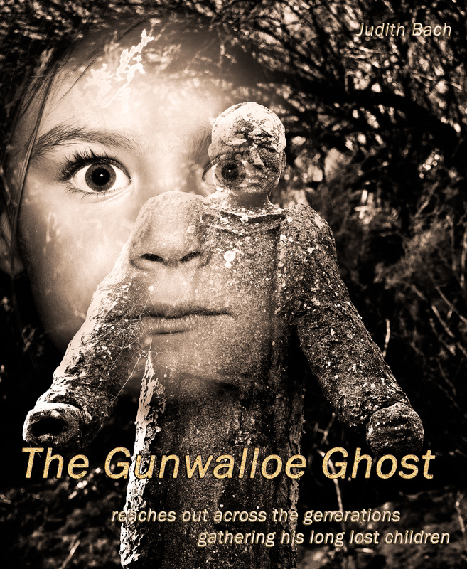
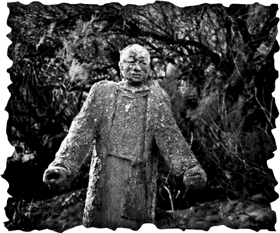
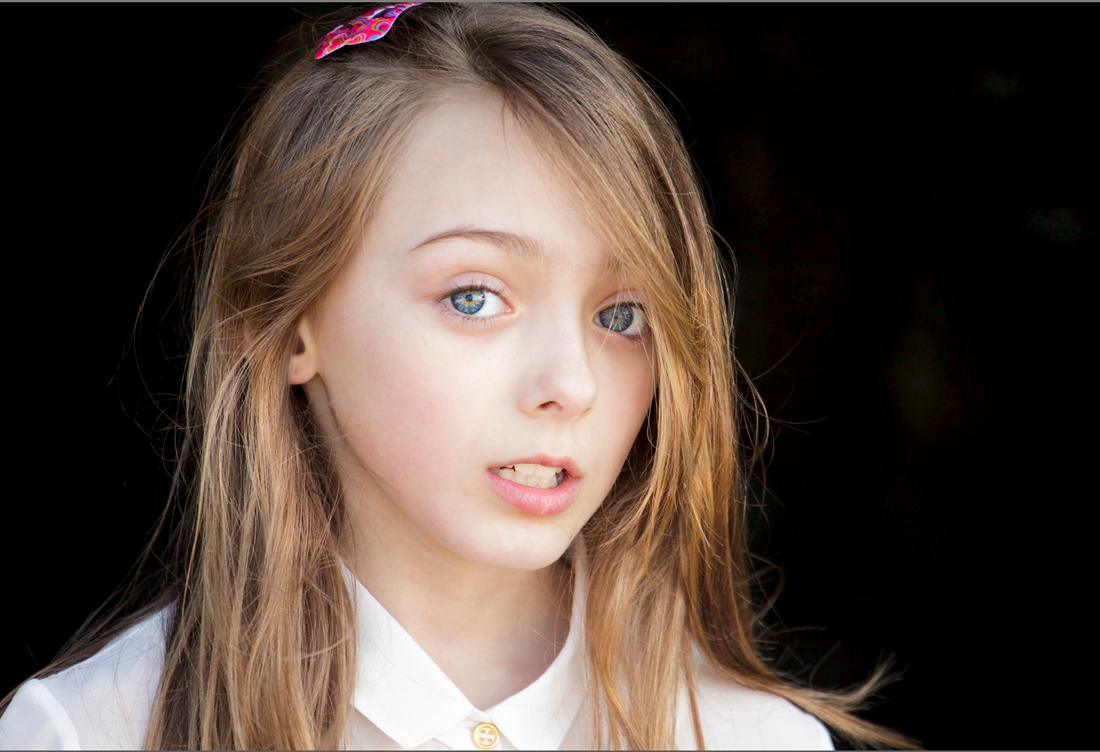
The Gunwalloe Ghost.
As I mentioned I am not that skilled using PS so this was quite a challenge for me. I had saved the original Gunwalloe Ghost as a Tiff file with the layers preserved so I was able to easily open the file again, add new adjustment layers, re-adjust and then save as a new Tiff file. Saving this 2nd image with the layers preserved meant I was able to keep going doing a bit of work on it , take a break ,then go back to where I left off. The only problem being these create quite big files , but at the moment I have lots of space on my hard-drive and back- up drive. I re-positioned the child to the top left hand corner of the cover using the move tool (Command + M ) as suggested by Russell. I re-positioned the text , increasing the font size. For the title I decided I needed to make it a lot more prominent and played around with the blend modes , I hope I have not gone over the top , son-in-law warned me not too, but I think the bolder title works reasonable well.
I kept the remaining text on the bottom of the book cover slightly smaller but still more prominent than in my original version, and again tried different blending options. I used the same blending mode for my name which I have now placed at the top.
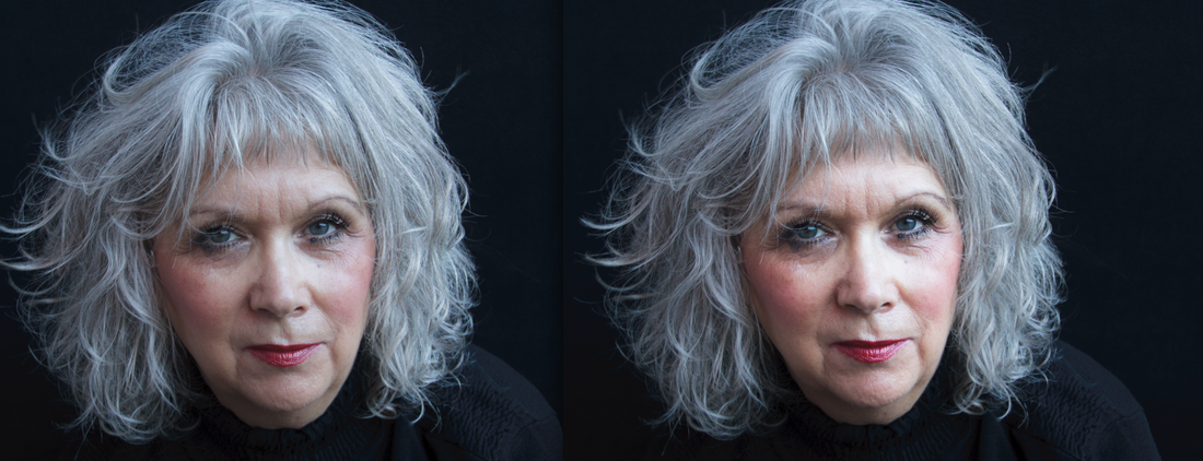
I tried placing the title in 2 different positions, I am really unsure which I prefer. I will print both versions , I prefer to actually study the prints over a couple of days rather that keep comparing on my computer screen.
Using a layer mask I blended the 2 images, this is the most time consuming task and one I needed to keep returning too over a few days until I was happy with the result. Using a layer mask I blended the 2 images again ( this is a time consuming task ) and one I needed to keep returning too over a few days until I was happy with the result. Russell made some recommendations regarding the opacity of the 2 figures , I am not too confident that I have achieved what he suggested. Re-positioning the child made my choice of how to blend and merge the 2 images slightly different than my original version.
To manipulate is to alter, influence, or control, a photograph can be used to mislead as well as inform and it is important to bear in mind manipulation is not exclusive to digital processing. Even before pressing the shutter a photographer can exert influence over how much of the truth is recorded and create a false reality. The choice of camera settings such as WB , aperture , shutter speed , filters , etc. are the photographer’s alone . Hence personal vision and artistic intent will influence how an image is planned and shot and as such may be considered a perhaps discreet form of directing its meaning.
Furthermore the choice of who or what to include in the frame can be used to alter reality and create a fake truth. In 1933 the Russian photographer Aleksandr Rodchenko undertook the brief of recording the building of the White sea (or Stalin) Canal. He generated approximately 3000 images, some of which were published in a magazine designed to display Soviet advancement , but “Rodchenko did not focus on the use of forced labour, or the deaths of thousands of workers at the site” pg. 242 Mary Warner Marien “ Photography: A cultural History” 3rd Edition Laurence King Publishing ltd, London, 2010 . His images recorded a distorted history and must be considered “as deceiving as reshaping pictures” pg. 518 Mary Warner Marien “ Photography: A cultural History” 3rd Edition Laurence King Publishing ltd, London, 2010.
Prior to the digital age darkroom techniques were used to manipulate and create new realties. However these were specialised procedures: the darkroom was not something the general public would have access to or have the knowledge to be able to use the skills involved. Along with the growth of digital technology has grown the ease and ability of vast numbers of artists to create new meanings in the digital darkroom. Charlotte Cotton implies “in an era where we receive , take and disseminate as well as tag , browse and edit photography imagery , we are all more invested , and more expert in the language of photography than ever before , and we have a greater appreciation for how photography can be a far from neutral or transparent vehicle for bridged and framed moments of real time. “ pg. 240 Charlotte Cotton “The Photograph as contemporary art” (new edition) Thames and Hudson, London, 2009.
This suggests we are less likely to be fooled by manipulated images which leads to the question to what extent does it matter ?
Personally what I feel matters is the aim and intended use of an image. When the truth is in question the balance between ethics and aesthetics needs to be carefully considered. Photojournalists and documentary photographers are purportedly recording the truth and as such to deliberately alter the meaning of this type image is inherently wrong. In contrast fashion and beauty magazines require images that sell and promote a certain lifestyle and usually feature airbrushed models , perfectly slim specimens with clear unblemished skin. However the image on the front cover promises something unattainable that has been “digitally constructed or manipulated” pg.199 Liz Wells “The Photography reader” Routlidge, Oxon, 2003. But would readers really prefer to see an uglier, fatter , spottier (but perhaps more believable) model adorning the front page? I somehow doubt it but this type of manipulation has led to accusations of creating gross insecurities about body size and looks. But can it be considered ethically wrong to produce such images when most , if not the majority, of viewers know and comprehend that the model on the front cover is a fake reality?.
For Assignment 4 I have to produce an imaginary magazine or book cover “that lies in the middle ground of the real-fake argument “ Pg. 64 Photography 1 Digital Photography Practice Open College of the Arts . I spent a long time looking at the many books I own and found that the majority had quite simple covers with varying amounts of text. As I am still developing (excuse the pun) my Photoshop skills and did not want to attempt anything too complicated I have chosen to create a fictional book cover. “Covers are sales vehicles for their contents , and so often quite widely interpreted by art directors, illustrators , and photographers. The moral ground is therefore potentially ambiguous.” Pg. 64 Photography 1 Digital Photography Practice Open College of the Arts . Who the book will aimed at , how to make it visually appealing to that particular audience, and importantly genre , all need to be taken into account
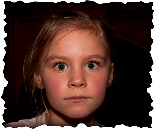
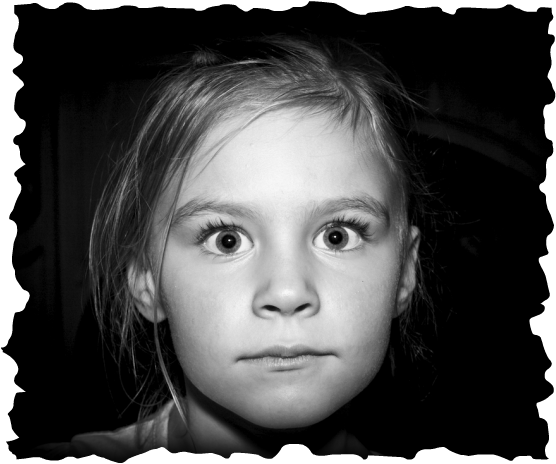
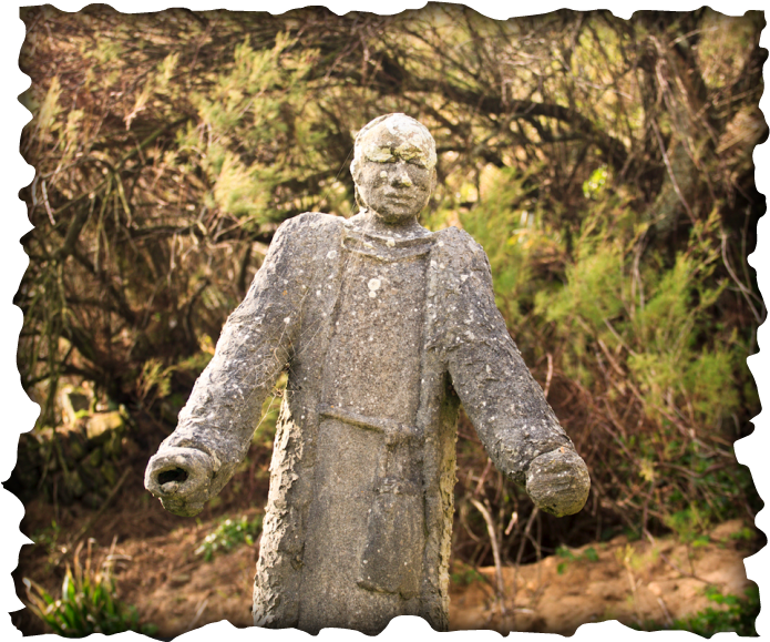
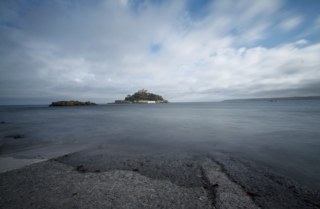
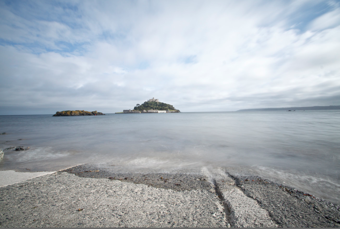
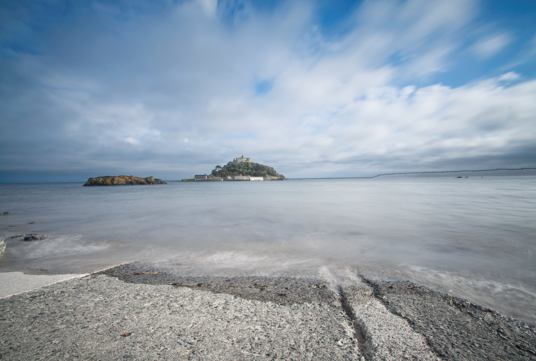
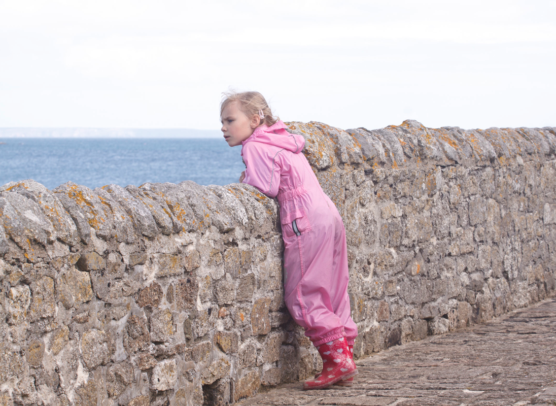
On a recent visit to Cornwall I visited Gunwalloe church Cove , also know as Dollar Cove, on the Lizard Peninsular. St Winwaloe, a 15th century church , is situated to one side of the cove. There have been many shipwrecks around the Cornish coast and myths abound as to what happened to survivors. A ship carrying gold was wrecked at Gunwalloe in 1780, the area is steeped in ancient history , and the church is built on ancient ley lines, making it a very atmospheric place to be. A standing stone man in the graveyard makes a very eerie tombstone and I really liked the idea of incorporating the ethereal quality of the place into a gothic novel cover. As children are often believed to be able to see ghosts that remain unseen by adults , who see the world through more rational or skeptical eyes, I have chosen to combine an image of a child with the ancient tombstone. I wanted this combination of innocence versus the paranormal to create a rather creepy looking image.
Both images were shot in Raw and initially optimized and converted to mono in Lightroom. Both images were then opened in Photoshop as two separate layers. I have been experimenting with using textures and decided to use the technique I have been practising to combine the two images. Using layers I was able to save my work as a layered Tiff image and return to it over several days to review and revise as needed . The final image has nine different layers.
Steps taken.
1. I made the gravestone image my bottom layer and placed the child’s image above.
2. I clicked on the bottom image to make it my active layer
3. Command & A to choose both images
4. Command & C to copy the bottom image
5. Command & V to paste the tombstone image over the child creating a new top layer I renamed Mask
6. I applied a layer mask to my new top layer and chose this as my active layer to work on.
7. Command & B to choose the brush tool , and selected black to paint over the areas I wanted to reveal or white to conceal.
8. I needed to review the image several times changing the brush size and going over different areas to show or hide the textures.
9. I tried various blending modes before choosing Luminosity at 100 % opacity
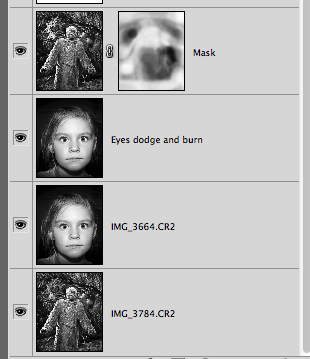
10. I then duplicated the image of the child and named it Eyes dodge and burn
11. Selecting this as my new active layer I used the dodge tool to brighten her eyes and darken her eyelashes and pupils very slightly before placing this layer below my Mask layer.
12. I then set about adding the text and created four separate layers
13. I chose Franklin Gothic book font . I am not an expert on typography so was a bit unsure what to choose but I wanted quite simple and understated text. I used the Linear dodge blending mode at 80%
14. My final layer is a warming Photo filter layer set at 57% density using a Hard light blending mode to create a sepia effect.
15. I cropped the image to a portrait orientation but needed to adjust my text layers several times to ensure they were included in the final print. This was not something I had not considered at the beginning and would have been beneficial if I had.
Girl Original image
F6.3 ISO 200 1/100sec @ 40mm Bounced flash
Mono conversion
Gravestone Original image
F4 ISO 100 1/200 sec @ 70mm
Mono conversion
I have enjoyed this assignment but is the image too far removed from reality? For the purpose of a book cover I feel the manipulation is justified. I am not using the image to prove ghosts and hauntings exist but to indicate the contents inside, a work of fiction. Therefore I feel morally justified, on this occasion, in creating a false truth.
Although I have used Lightroom for some years I am not an experienced Photoshop user by any means having only moved 18 months ago from Elements to CS5 and as such am not that confident in my manipulation skills . However working through the exercises in section 4 has been enjoyable and I am slowly building up the confidence to do more post processing than I normally undertake.
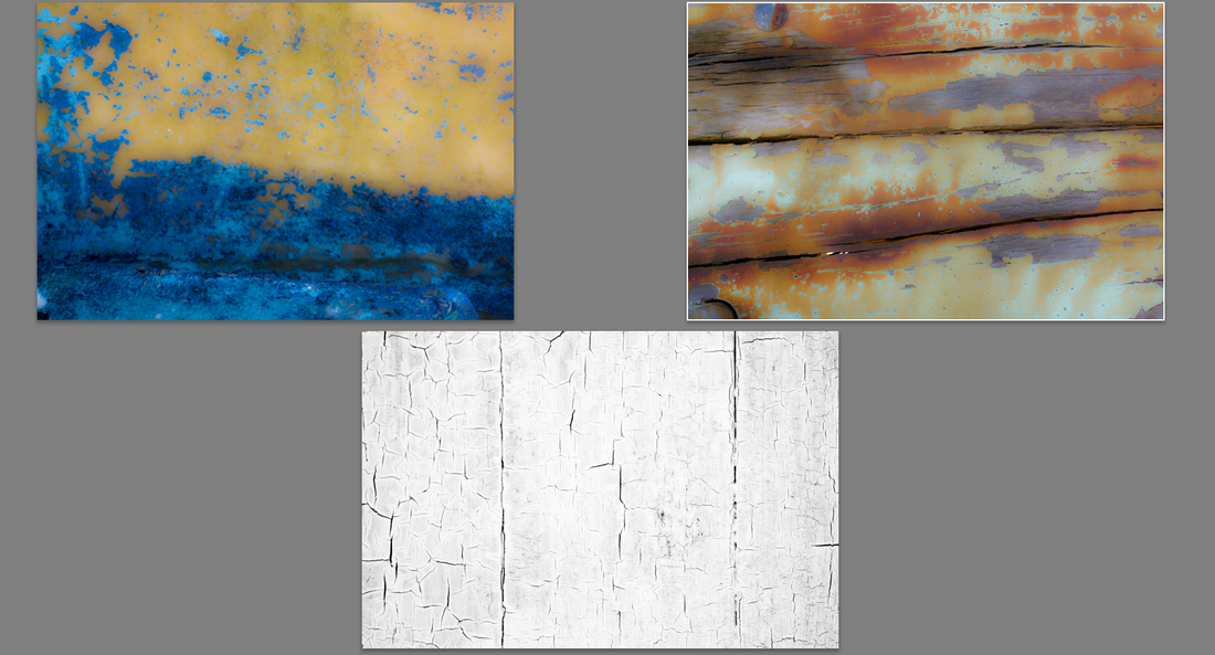
I have started to build up my own collection of Textures and have been photographing things that I find visually appealing that might make useful alternative backgrounds. Its amazing when you take the time to stop and look how much colour and texture can be found in the most mundane object. The inside of a wooden blue and yellow boat, peeling paint on a front door , mossy rocks etc. I shoot my chosen texture subject in Raw and process it ready for me to use.
The textures can be used to make understated or quite significant changes to an image and I have been using layer masks and experimenting with the different blend modes available .
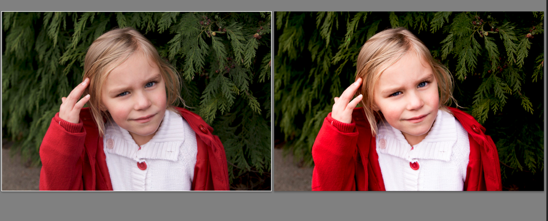
The image below has been touched up to smooth the skin and brighten the eyes using the tools available in LR and then processed further in PS using a blue and yellow texture as the new background. I made a layer mask , inverted the texture , and adjusted the hue and saturation until I was happy with the result. I also used the dodge and burn tool on the eyes.
Original image Texture Texture + image For the next image I used a close up of old white peeling paint on a wooden front door as my texture and used the Divide blending mode which has created the deep crackled effect. I have left some of the texture visible in the hair but painted it out from the face. I also used the dodge tool to brighten the eyes.
Original image Texture Texture + image
The final exercise of this section of the course is alteration: removing an element from an existing image. Something that was there at the time of shooting is going to be deliberately removed. By removing an object or person from an image the truth is being altered without any doubt. Just how much impact this kind of intentional subtraction has greatly depends on the context in which the original photograph was taken.
Stalin removed political opponents when they fell from grace, the past was re-constructed. This is wrong , we rely on documents and images to understand the past and its influence on the future. Photojournalists follow a code of ethics that require their images to be unbiased and record events honestly. To deliberately manipulate these images, that purport to be objective and record the truth , is also wrong.
However the art and advertising world have a different set of ethics ,is it so wrong to remove a person or an unsightly object from an otherwise acceptable image?
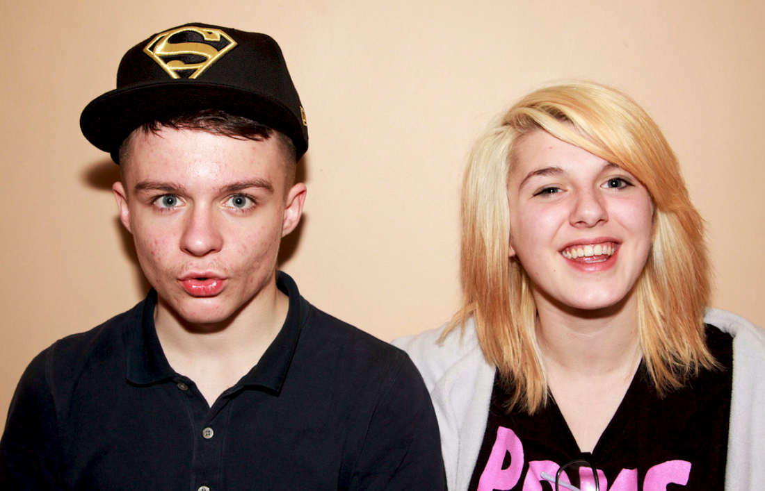
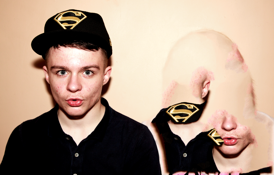
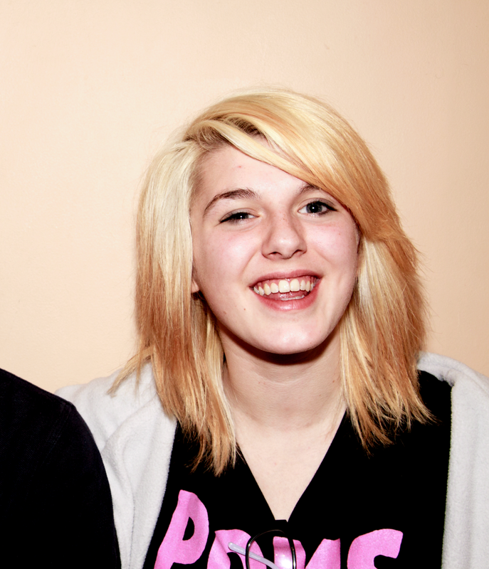
I took the image below of two friends, Jack and Alex, at a party and have chosen to remove Alex from the frame. Why?
What if Jack fell out with Alex and did not want a reminder of his friendship , or perhaps a relative wanted a photograph of him on his own? By removing Alex from the photograph I have created a new reality but am I denying she exists ? The intent behind the manipulation is the key , why an individual or object is being removed is of sole importance.
Jack Alex
I initially tried the Content Aware tool having made a selection of Alex using the magnetic lasso tool ----not very successful!!!
I then used the Clone stamp tool, the Patch tool , and finally the Dodge and Burn tool to tidy up with much better results.
Alex
Alex vanishes !!!! Finally I added a levels and vibrance adjustment.
I think it looks ok and I am pleased with the final result.
I also used the Channel mixer to convert to a mono version.
Part 1. For the first part of this exercise I had to choose two landscape images taken in sequence to combine into a single image .
Exposed for the sky
ISO 100 F16 3.2 Sec @ 10mm
Exposed for the foreground.
ISO 200 F16 2.5sec @ 10mm
I opened both images as layers in Photoshop placing the image exposed for the foreground at the top. I then used the quick selection tool to make a selection of the overexposed sky and hit the delete key to erase it. As I chose quite an undetailed and clean horizon line it made the task easier than I expected. I am not sure if I am proficient enough yet to make more complicated selections but am happy with the end result for my first attempt at combining two images to make a new one.
Exposed for sky Exposed for foreground Final combined image I see nothing wrong with this type of manipulation , The camera sensor , unlike the human eye , is unable to adjust when viewing a scene such as this. Combining these two images simply replicates how I initially visualized the scene and therefore do not consider it alters the truth.
Graduated filters are considered a perfectly legitimate method of achieving a better exposure in-camera whilst shooting , what is the difference between using a digital method post shoot to achieve the same end result?
Part 2. For the 2nd part of the Addition exercise I needed to replace the sky from one image and choose a sky from another image to replace it.
Using layers I created two different versions as I worked on the image.
1.
I opened up both images in Photoshop choosing an image of Caitlin with a very pale and washed out sky behind her. I copied and pasted it onto the image created for the first part of the exercise as it had a more summery sky.
2.
I then created a duplicate copy layer image and turned this layer off.
3.
Returning to my original first layer I made a selection of the areas I wanted protected and added a layer mask, white shows the areas to be protected and black areas will be hidden. I actually found it easier to make a selection of the sky and inverse the selection.
Version 1.
I think this looks false –the small area of horizon between the sky and sea creates a rather wonky looking line !
Version 2.
For my second version I also included the sea visible to Caitlin’s left in my selection to be hidden. I think this second version looks better even if I have altered the actual reality of the scene.
4.
I returned to the duplicate copy layer making my original image visible again. Double clicking I then opened the blending options choosing blend to blue dragging the top slider from right to left until I was happy with how the sky looked. The image was then adjusted to reduce any fringing by holding the Option key (Alt on a PC) and dragging the slider to the left which then split into two. At this point I could release the Option key and adjust my image.
5.
The final image.
I added a Vibrance and Curves layer.
I have enjoyed this exercise , but doubt I would use alteration of this type often.
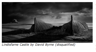
Landscape photographer of the year 2012 David Byrne lost his prize of £10,000 (ouch!) and was disqualified for excessive use of digital manipulation, including replacing the sky.
Moving up a level this exercise looks at making changes to a portrait that may be considered to be altering reality. I used a self-portrait taken outside using available light with my face in shade out of direct light as instructed.
1.
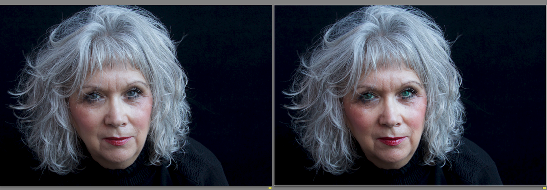
I needed to make a selection of just the face and then increase the contrast and brightness . Working on a duplicate background layer I used the magnetic lasso tool with a feather setting of 30px in Photoshop to make my selection and created a layer mask. I found until I increased the amount of feathering the editing was very noticeable (it was quite difficult to be very precise around the hairline). However I feel this procedure has actually enhanced the image and as the aim of this part of the exercise was for the image to remain natural looking I am pleased with the outcome. This is considered standard dodging , not a new technique by any means , and as such perfectly legitimate to my mind. I feel I have learned something new through this exercise and would certainly use this kind of enhancement for processing some of my portraiture work.
Before selection. After selection. The difference is quite subtle. Before After 2.
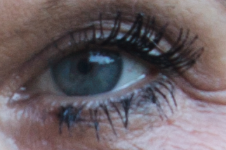
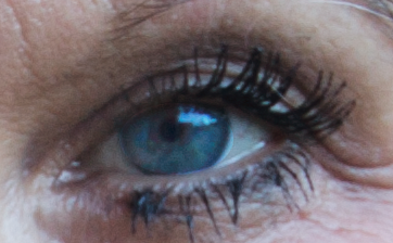
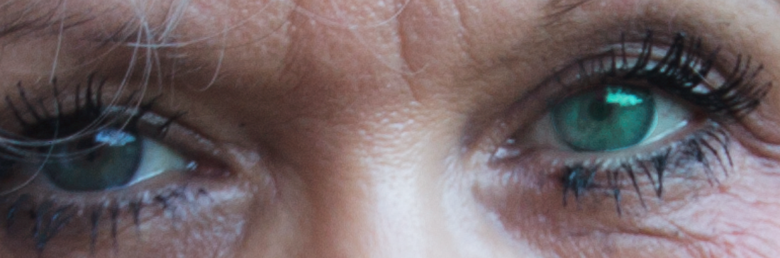
Making a selection of just the iris and pupil I then exaggerated the colour and brightness of the pupils. Again I just made a subtle alteration and at this point if I had made greater adjustment’s I feel the image might become a less honest representation but actually still reasonably truthful.
Before After
3.
Taking a further step I then altered the hue of the eyes (my eyes are green/grey and I have always fancied greener more emerald eyes! ) . At this point I think the image started to become unreal and I felt I was beginning to alter the truth. The person in the image was becoming someone different, but is this such a bad thing? I use cosmetics to enhance my appearance, is it so wrong to use digital techniques for the same purpose? My daughter has green coloured contact lenses what is the difference between those and changing my eye colour digitally? However a photographic portrait is usually presumed to be an accurate and truthful representation of that person , at what stage does this type of enhancement falsify that reality? This is quite pertinent for me to consider carefully as I continue with my portraiture work.
Glossy magazine are notorious for their use of digitally enhanced images that depict models with perfect skin , teeth , and bodies . Any, even minor , imperfections are frequently airbrushed out. Whilst this may be deemed acceptable in the world of advertising I am not convinced too much enhancement has a place in my own everyday workflow. I am not against using methods to improve my subject occasionally, remove spots etc. But I also see nothing wrong with flaws and wrinkles and often exaggerate the latter -- a kind of reverse enhancement perhaps. Most importantly I feel a meaningful photographic portrait should show a likeness not too far removed from reality.
Before After Original Final result
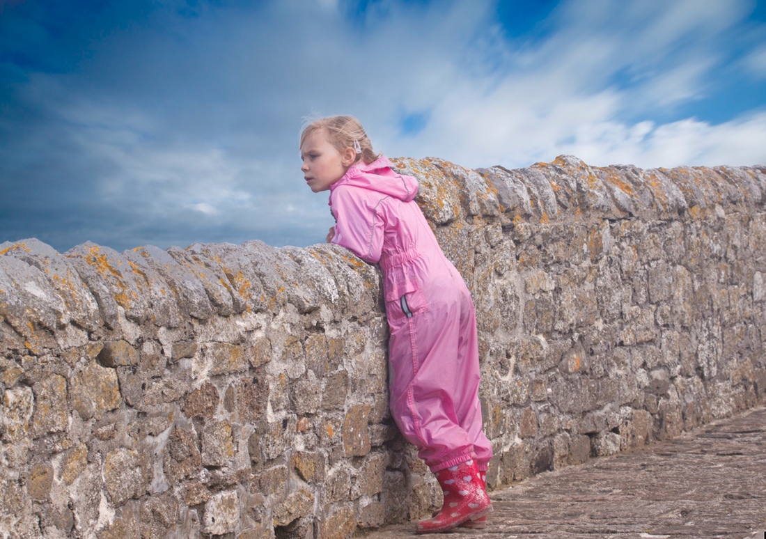
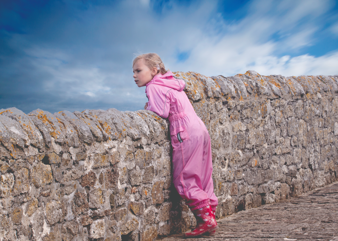
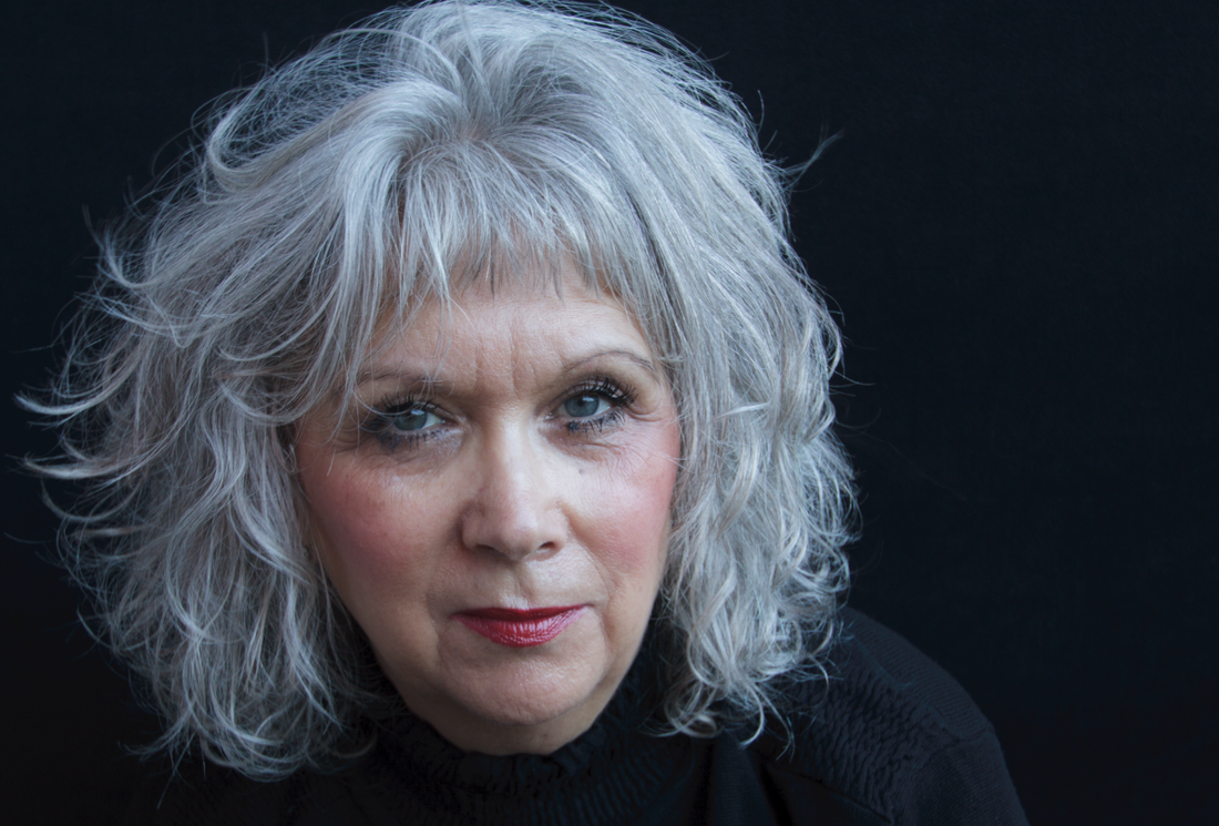
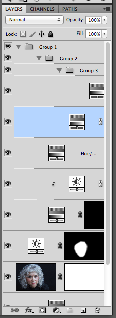
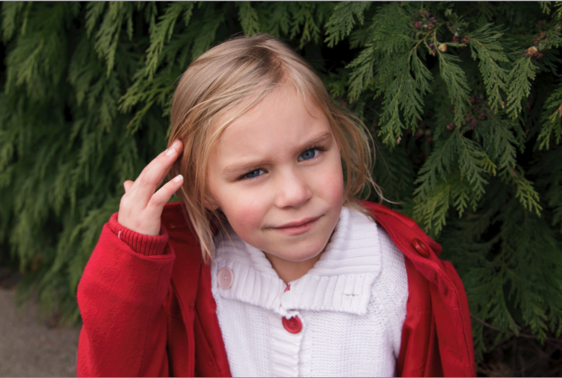
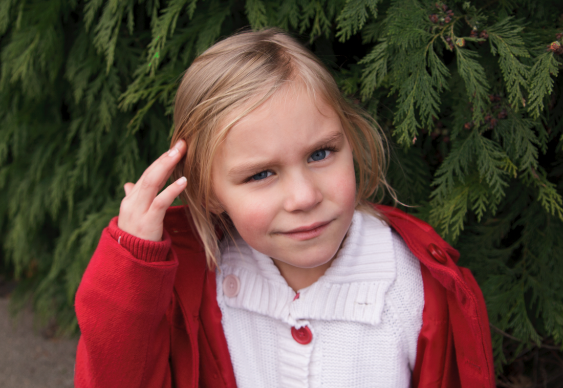
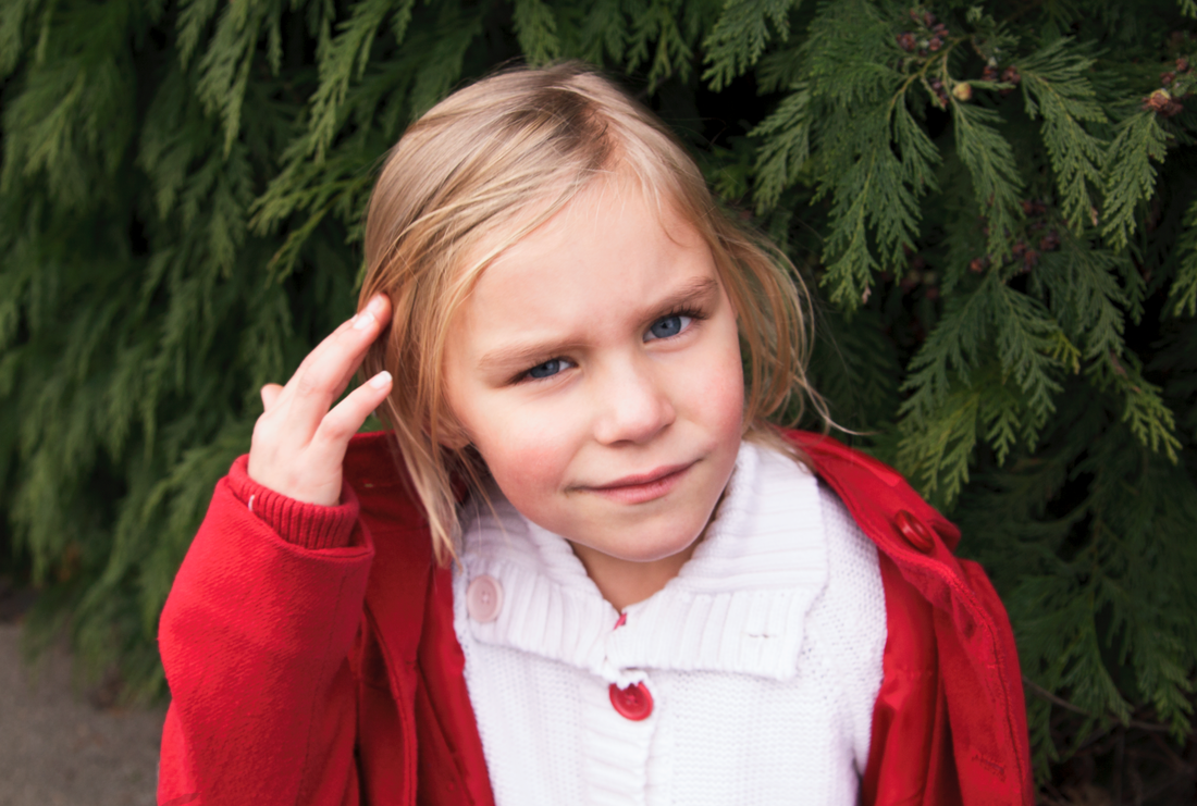
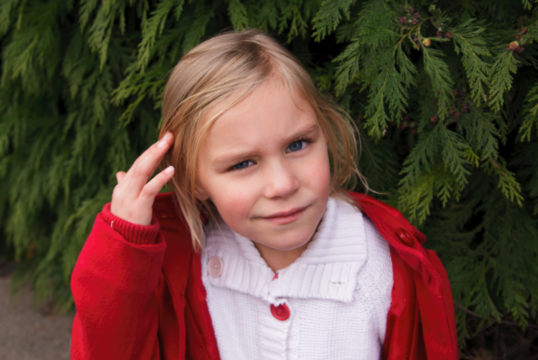
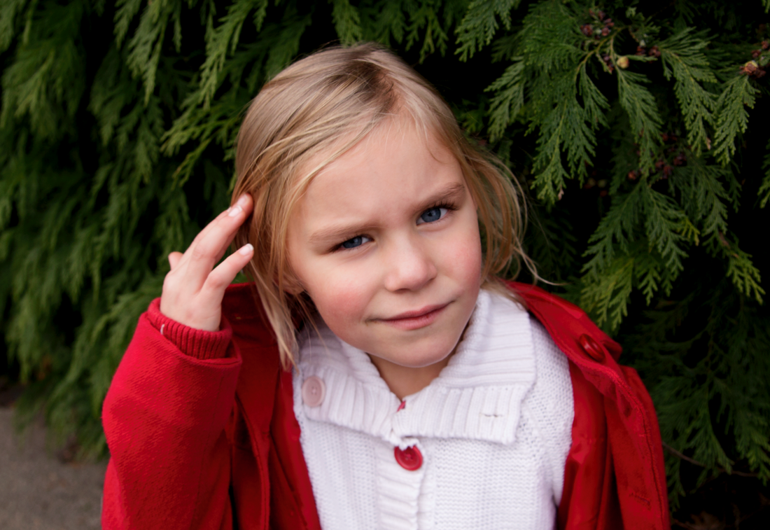
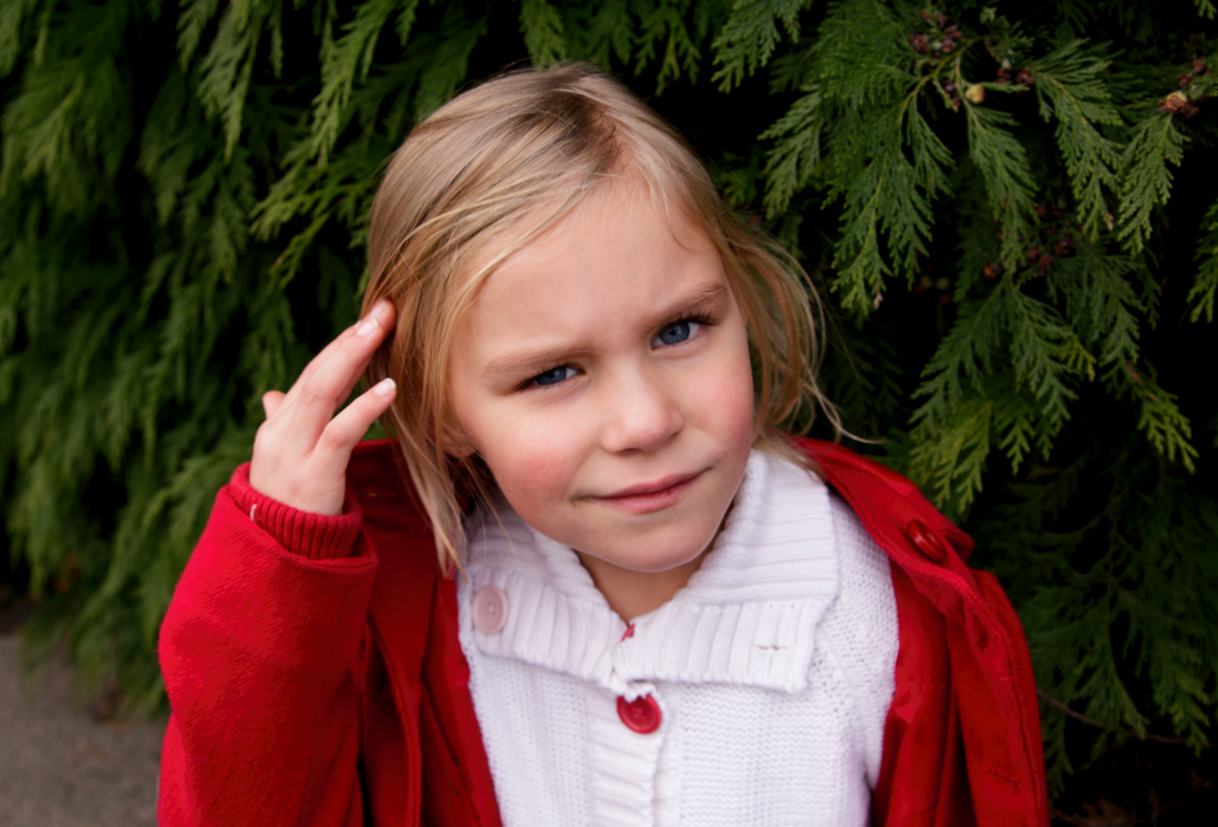
For this exercise I need to make local, not global adjustments to a portrait image using a manual selection method. The aim is to make the subject stand out more clearly from the background whilst still retaining credibility. This type of manipulation is open to interpretation and is hence subjective, how much is too much adjustment? I personally like very saturated colour, but that is not to everyone’s’ taste. I do not like over manipulated images that then fail to look realistic but as I gradually learn more Photoshop techniques I find myself experimenting more, and I do enjoy the ability to have total control over the final outcome.
The original optimised image looks fine to me and I would not usually do any more work than has already been done. As my PS skills are self-taught and I have not had any reason to attempt more intricate work I took quite a few hours before I actually even managed to create a layer mask to work on! Unless any of my images were exceptional I cannot see me performing this sort of manipulation on a regular basis---far too time consuming , I would rather be shooting. However I did enjoy the exercise and became quite absorbed. To make my subject ( Caitlin ) stand out more I increased the vibrance and brightness , made a curves adjustment to increase the contrast, and finally decreased the yellow saturation very slightly to alter her skin tones. Have I improved the image? I am quite pleased with the final result , it is brighter with bolder brighter colour, but that is my opinion, not everybody would agree, its my personal interpretation.
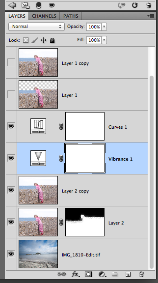
I made a duplicate layer and used the magnetic lasso tool to select Caitlin saving the selection as a mask. I then created several adjustment layers.
Before After Original optimised image 2. + Curves adjustment 3. + Brightness adjustment 4. + Vibrance adjustment 5. + Levels adjustment to whole image 6. + Saturation adjustment --yellow decreased to alter skin tone 7. Final image
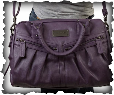
Its my birthday today and I have had a Kelly Moore Mimi bag. It is in a gorgeous lavender shade and as well as fitting my DSLR and 3 lenses comfortably I can also carry my glasses, mobile and lipstick. A black masculine camera bag is so unstylish (!) and I plan to carry my camera around with me far more than normal now. All too often it gets left behind because I really can't be bothered to lug a handbag and camera bag at the same time, I have no excuse now. http://www.everleaf.bigcartel.com/
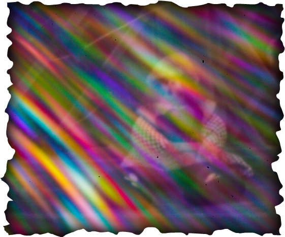
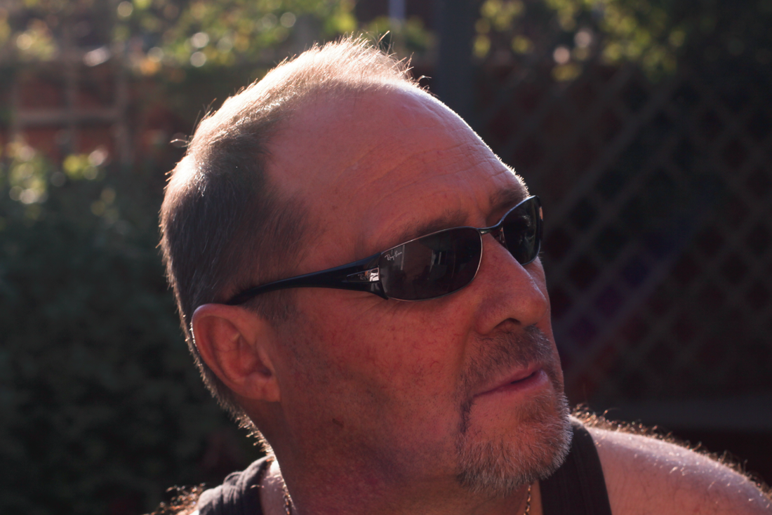
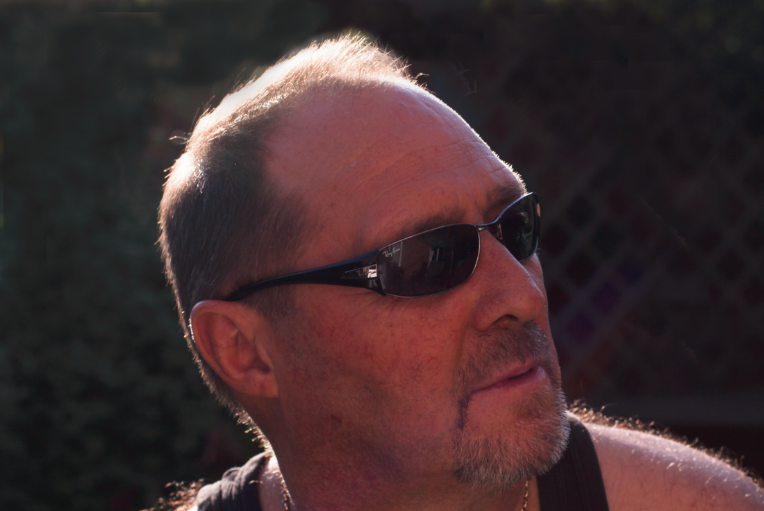
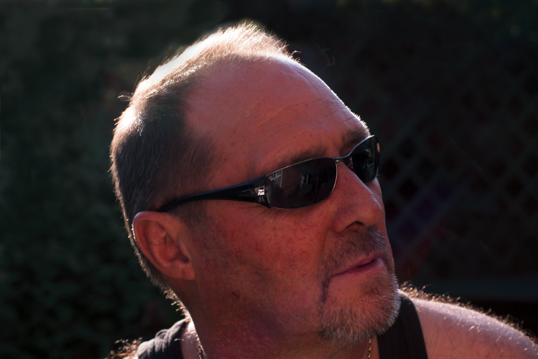
I need to find two images from my collection , one with dust shadows, and the other with polygon flare.
Removing dust shadows.
I routinely remove unsightly dust specks from some of my images if needed and find this a relatively easy task and not something I consider detrimental to the final outcome. I have not given much thought to the fact that I am actually altering the content of a digital file. I notice these unsightly spots more frequently when using my wide angle lens for landscape work especially when there is an expanse of cloudless sky visible and even more so for any images taken using my pinhole lens cap , my sensor must be filthy!
Lightroom has a choice of image retouching tools available and I had a choice of the clone or heal tool for this exercise. Although the clone tool copies and repairs the chosen area it does not blend like the heal tool will using the surrounding pixels.
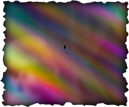
I have chosen a pinhole image converted from a Raw file that has ugly black dust spots visible. I was able to use the Heal tool in Lightroom quite easily for this. The black spots (which are not as noticeable here as on my home computer screen and when printed ) are unsightly and I see nothing wrong with enhancing the image by removing them. However I did notice when zooming up close to review the heal adjustments I initially made that certain areas of the image did not look right. Hence I made the decision to not tidy up too much and left some of the lighter blemishes un-corrected: I considered they were not detrimental to the final image. How much is too much re-touching , when does reality become fake? That is quite difficult to decide and I think will always depend on the image being corrected and how far removed it becomes from the original digital file. I consider the use of the heal tool quite reasonable and in this case I do not consider it has altered the authenticity of this particular image.
Image before removing visible black dust spots.
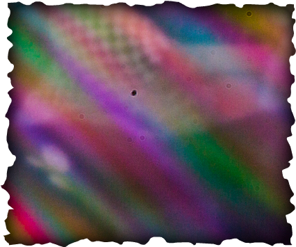
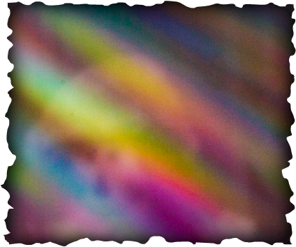
After using Heal tool. Correction: Polygon flare
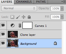
I looked through my photo library and actually had few personal examples of images with polygon flare as I would usually discard them unless I found them aesthetically pleasing. I have chosen a portrait image taken with the sun directly behind my subject and I must confess the resulting flare visible as a line of circular spots did not concern me too much. The dust removal tool in Lightroom is great for small specks and spots but I edited this image in Photoshop using the Clone stamp tool set to darken and also applied a curve adjustment to the whole image. Although I use Lightroom to process all my Raw images and do slight adjustments in Photoshop I am not that confident in making major manipulations. I even managed to clone the face initially (!!!!) but after an hour or so, and with some fine tuning of the brush size as I worked around the areas I wanted corrected, I was happy with the result. I cloned more of the area than necessary , extending beyond the areas with flare, to make the background plainer isolating the subject making him more prominent in the frame. Although prior to doing the coursework I would probably have not bothered doing this kind of correction I am quite pleased with the outcome. This was a relatively easy correction using the Clone tool as the background was not totally plain, not that detailed, and has slight variations of tone making the end result lest detectable than I felt it would be. I am sure there are scenarios when the correction would become very noticeable if not handled very carefully. To avoid lens flare, unless intentional, the ideal would be to re-compose and re-shoot but I do not consider this type of post shoot manipulation to be wrong or far from the original truth of what I saw through the lens. I certainly did not see or intend the flare to be visible therefore is it that wrong to remove it?
Original Image Clone stamp layer Clone stamp with Curves adjustment layer
|


 RSS Feed