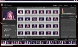
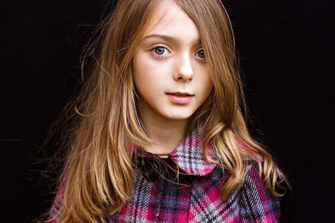
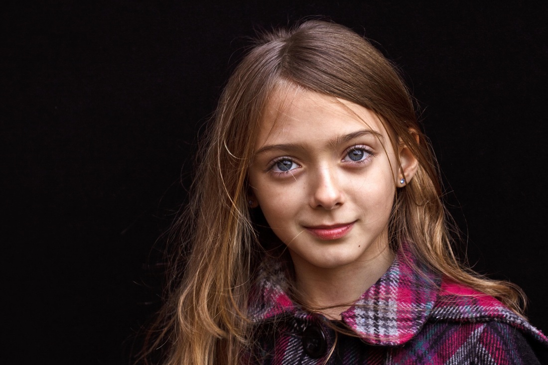
This project consists of a structured approach to choose just 2 final images out of a set of at least 50 that deal with the same subject matter. For the purpose of the project I need to imagine that these 2 images might be used for a publication. I want what I learn from this project to form the basis of how I am going to manage my editing in the future, I want an easy and efficient method that I will continue to use . I use Lightroom to catalogue my images so it makes sense to use the library module to categorise and filter each shoot. I started with 56 portrait (head/shoulders) images, all very similar in composition, taken in sequence during a single session. All were taken outdoors using available daylight using a 50mm prime lens , cable release, tripod , and a black backdrop. My model , Maisie, is my granddaughter who is 8. I often find my best images are towards the end of a session as my model (whoever that may be) relaxes more and takes less notice of the camera. I also check the histogram as I go along so often get better technical results as I can correct any glaringly obvious exposure problems early in the shoot. I will be interested to discover at what point during this session my final chosen 2 favourites were taken.
Step 1 The technical edit
Rejecting images at this stage is not for any artistic or aesthetic reason. Looking at the images in the LR browser any displaying camera shake, badly exposed, or not in sharp focus were flagged red "to delete" . Also included in this initial selection were any that were obviously unsuitable , for example in one frame Maisie's eyes were shut .A total of 10 were initially flagged red and deleted. This is perhaps the easiest editing decision to make-- the choices made later are more subjective.
Step 2 The selects
At this stage I was careful to examine Maisie's varied facial expressions and stance . Choosing between some of the very similar images took more time than the initial technical edit and I included a few that I could not make an immediate decision about. Out of the 46 left I whittled these down to 24 which were then given a "star rating" of 2 making it easy to review them together again as a single group. I excluded any images that did not capture exactly what I was aiming for. Even though I used my cable release and was able to observe Maisie's facial expression carefully when shooting there were a couple of unflattering poses.
Step 3 The first selects
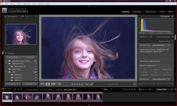
With just 24 images left it I thought it would became a more difficult task. Interestingly I found by filtering the images into different categories and then being able to then view them as a group independently made the task easier . I have never reviewed, and flagged my shoots into groups like this before, so using a system like this in future will definitely help improve my own personal workflow. Some were so similar I needed to scrutinise them carefully to pick out just the slightest difference and choose, what I felt, was the better image. Pose, facial expression, and because I was using a child, how appropriate the image (see reading section re Vogue images) were all equally important. I rejected some very tightly composed headshots preferring the head and shoulder images shot later in the session. I like very close up portraiture but these seemed unbalanced, too posed, and unflattering . They were also the initial shots of the session, I feel the later images, composed slightly differently, improved the final outcome. I then gave each a "star rating" of 3,choosing 10 first selects from which to make my final choice of 2. Eye contact is important in portraiture but I sometimes find the most telling images are those without this direct gaze, for this reason I have also included 3 frames in which Maisie looks away from the camera.
Step 4: Group and review
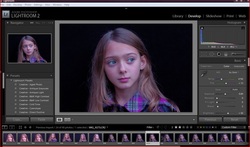
After a break--shopping & visiting I reviewed my choices again. I was generally happy with my first and second select choices, but felt one of my initial first selects was actually not as good as the remainder so reduced its star rating, leaving just 9 starred favourites . Maisie's lips looked rather too pursed , something I had not really noticed, this spoiled the overall image, so having a break and reviewing the images again was worthwhile .
Step 5: A final choice
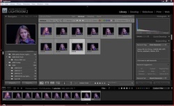
Out of the nine remaining 3 starred images a choice needed to be made for my final two and I think they are technically the best from the series of shots taken. These were awarded 5 stars. (I shall keep my 4 star rating for those images that I feel may be used but need more PP work) Having started with over 50 images I thought it would be difficult to choose just 2 favourites. What I found however was by breaking the workflow into workable sections and making a decision at each stage helped simplify and focus my mind more clearly. Interestingly , having made my final decision, I found post-processing could be kept to the bare minimum. Having chosen the best , technically and aesthetically, reduced the amount of time spent working in LR & PS.
Conclusion & thoughts about project.
I think the valuable lesson I have learned is just how important it is to spend time weeding out bad, and just average, images and concentrating only on what I consider my personal best. The time is well spent at this stage and helps create an efficient and proffessional workflow. This does have drawbacks, like most other novice (and probably professional) photographers my harshest critic is myself. But by raising the standard I need to reach and critically reviewing my own images I can hopefully improve, gain confidence, and perhaps even create a masterpiece !!! Both my final chosen images were taken towards the end of my session, and I feel are not only technically the best but are aesthetically pleasing too. Using my own family as models does have drawbacks, I am involved with them and need to be careful not to allow this to influence how I choose to portray them and be seen by the world.
After a break--shopping & visiting I reviewed my choices again. I was generally happy with my first and second select choices, but felt one of my initial first selects was actually not as good as the remainder so reduced its star rating, leaving just 9 starred favourites . Maisie's lips looked rather too pursed , something I had not really noticed, this spoiled the overall image, so having a break and reviewing the images again was worthwhile .
Step 5: A final choice
Out of the nine remaining 3 starred images a choice needed to be made for my final two and I think they are technically the best from the series of shots taken. These were awarded 5 stars. (I shall keep my 4 star rating for those images that I feel may be used but need more PP work) Having started with over 50 images I thought it would be difficult to choose just 2 favourites. What I found however was by breaking the workflow into workable sections and making a decision at each stage helped simplify and focus my mind more clearly. Interestingly , having made my final decision, I found post-processing could be kept to the bare minimum. Having chosen the best , technically and aesthetically, reduced the amount of time spent working in LR & PS.
Conclusion & thoughts about project.
I think the valuable lesson I have learned is just how important it is to spend time weeding out bad, and just average, images and concentrating only on what I consider my personal best. The time is well spent at this stage and helps create an efficient and proffessional workflow. This does have drawbacks, like most other novice (and probably professional) photographers my harshest critic is myself. But by raising the standard I need to reach and critically reviewing my own images I can hopefully improve, gain confidence, and perhaps even create a masterpiece !!! Both my final chosen images were taken towards the end of my session, and I feel are not only technically the best but are aesthetically pleasing too. Using my own family as models does have drawbacks, I am involved with them and need to be careful not to allow this to influence how I choose to portray them and be seen by the world.
 RSS Feed