This section of the course examines the relationship between digital photography and the truth.
Definition of Manipulation:
Distortion/Forgery/Fiddling/Misrepresent/Alteration/Correction/Improvement/Modification/Adjustment/Tweak.
Framing , focal length, filters, juxtaposition, choice of film if analogue , etc. all contribute to how the final image will appear , and as such must also be considered manipulative.
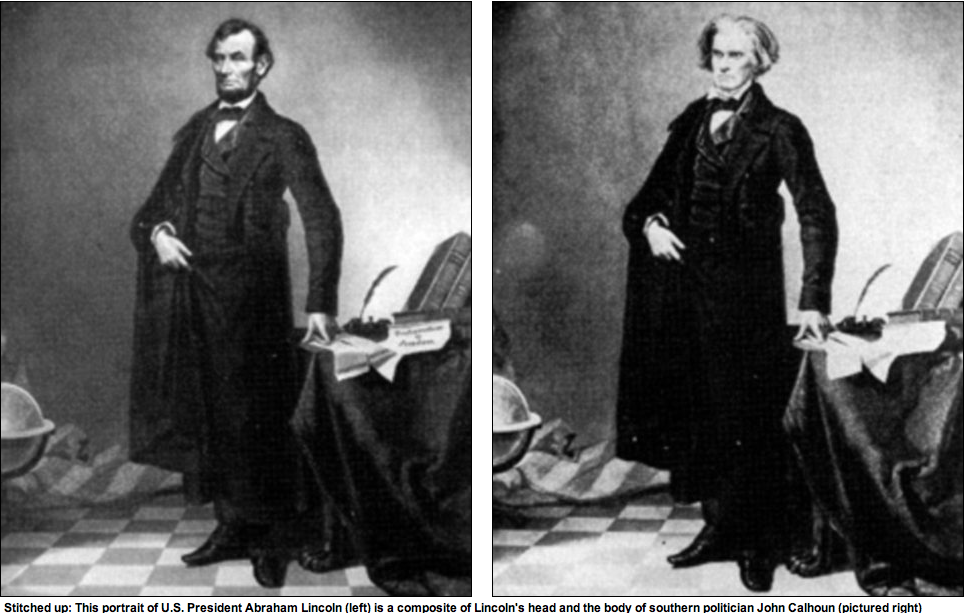
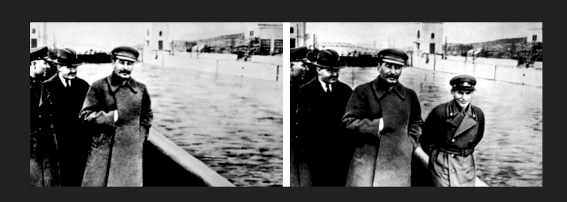
Image manipulation is not new : A composite image of President Lincoln with his head placed on John Calhoun’s body was produced in the 1860’s. Stalin removed political opponents when they fell from grace, the past was re-constructed.
However with the advent of more sophisticated easy to use software , mobile phone camera apps , and smart cameras the ability to alter reality, and the truth, has grown. Prior to the digital age non-professionals would have limited skills in manipulation.
Aesthetic values versus integrity are equally valuable factors to consider when altering reality: the intent behind the image when the truth is in question is of upmost importance.
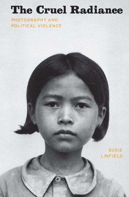
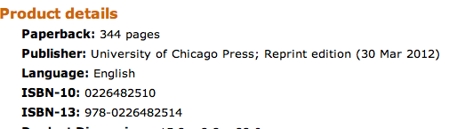
I am reading The Cruel Radiance by Susie Linfield. The University of Chicago Press Ltd , London 2010 at the moment and it is not a comfortable read , hardly bedtime material.
The cover looks innocuous enough but the calm gaze of the child on the front cover is deceiving. This is no family snap but an image of a child prisoner of the Pol Pot's Khmer Rouge prior to her execution.
Taken out of context the image is simply a portrait of a rather serious small child. However understanding the history behind the photograph provokes a reaction. It makes me personally angry and sad knowing what happened to not only this child but all the other countless individuals who have the misfortune to be victims of regimes that have little or no respect for their fellow human beings. “Photographs-especially portraits , though not only they, demand that we encounter the individual qua individual: precisely what totalitarian ideologies forbid” pg. 97.
However are images of human pain and suffering immoral as suggested by some critics? Central to the principle of Susie Linfield’s book is her argument that these images are , and continue to be , justified and relevant. However horrific they may be these images lead to the growth of groups who care and demand change to human rights.
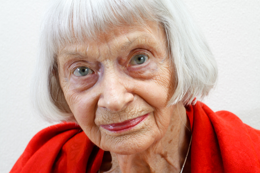
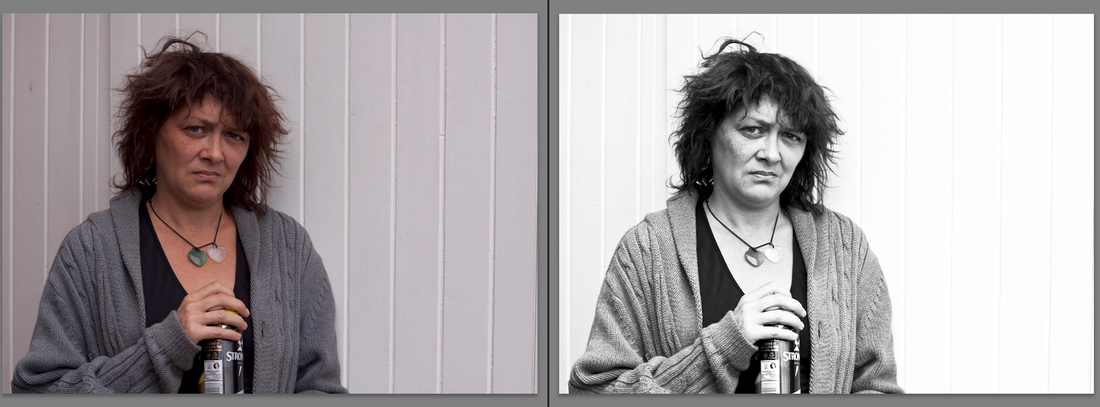
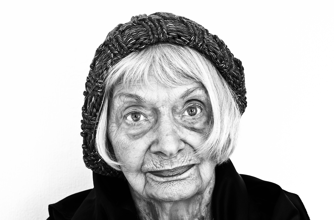
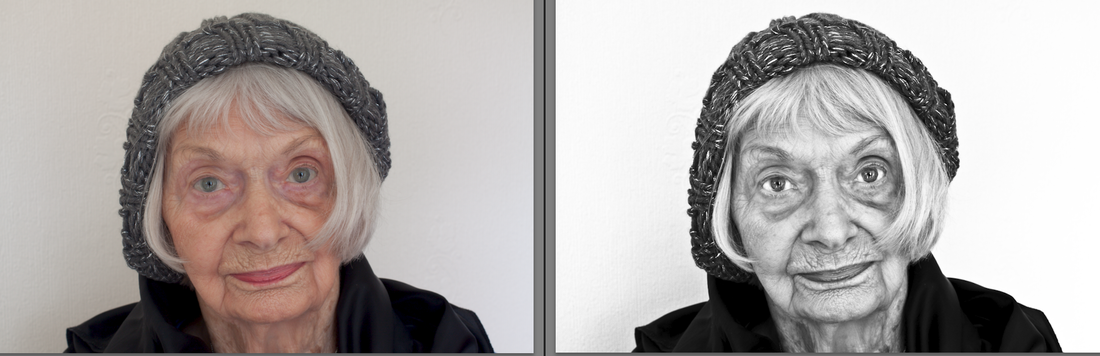
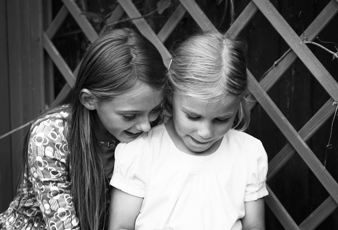
I wanted to celebrate my Mum's 87th today by taking a portrait of her. The family all went out last night for a meal so she was exhausted and wanted to be at home on her big day. I used the opportunity to do a short planned portrait session of just 20 images, bearing in mind the things I have learned during the coursework . I find I am taking less, not more, photographs as the course progresses , preferring to take longer and plan more carefully each session. I travelled light with just my tripod, 50mm prime lens , and flash. This was her favourite taken that day, the beauty of shooting RAW is being able to make multiple versions of the same image and I processed both a mono and colour version , she prefers the colour version.
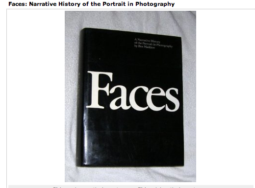
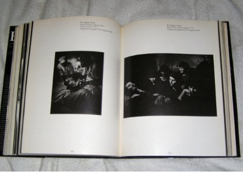
I bought this beautiful photography book for £20 tracing the origins and history of portraiture from a second hand book shop in Falmouth, this was a bargain I could not resist.
by Ben Maddow.
Old photographs and their place in history.
Browsing around an antique/junk shop in Falmouth I came across a box of old photographs, this intrigued me –why were they here? I have two suitcases of old photo’s that I could not bare to part with , they form part of my life, where I came from :some dating as far back as the late 1800’s . The shop owner explained they are often given away by families who have no idea who the subject’s are or what relationship they might have to them. How did this happen -- how sad to think a family’s social history could be so easily lost and disregarded.
How strange that later that day I read an article by Sarfraz Manzoor who discusses the importance of family photographs . His family images are extremely sparse with important occasions un-recorded. He believes “ photographs can help to give context and colour to the past: relatives who are long-dead or whom we view through a rigid parental prism, or through the fog of memory are revealed as fully fleshed human beings” pg. 2 Family Saturday Guardian 6/10/2012
(Read the whole article below) http://www.guardian.co.uk/lifeandstyle/2012/oct/06/sarfraz-manzoor-empty-family-albumSusanna Heron Shima : Island and Garden.
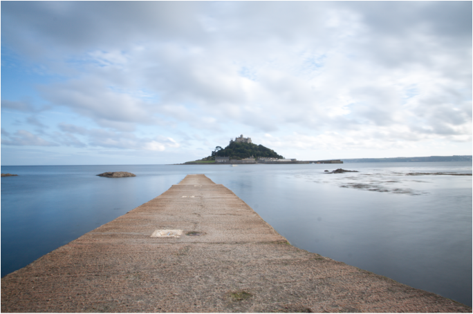
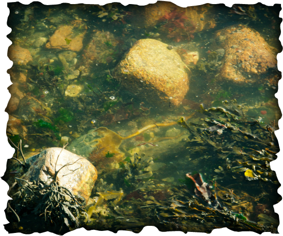
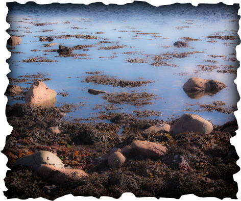
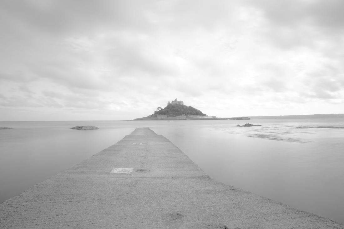
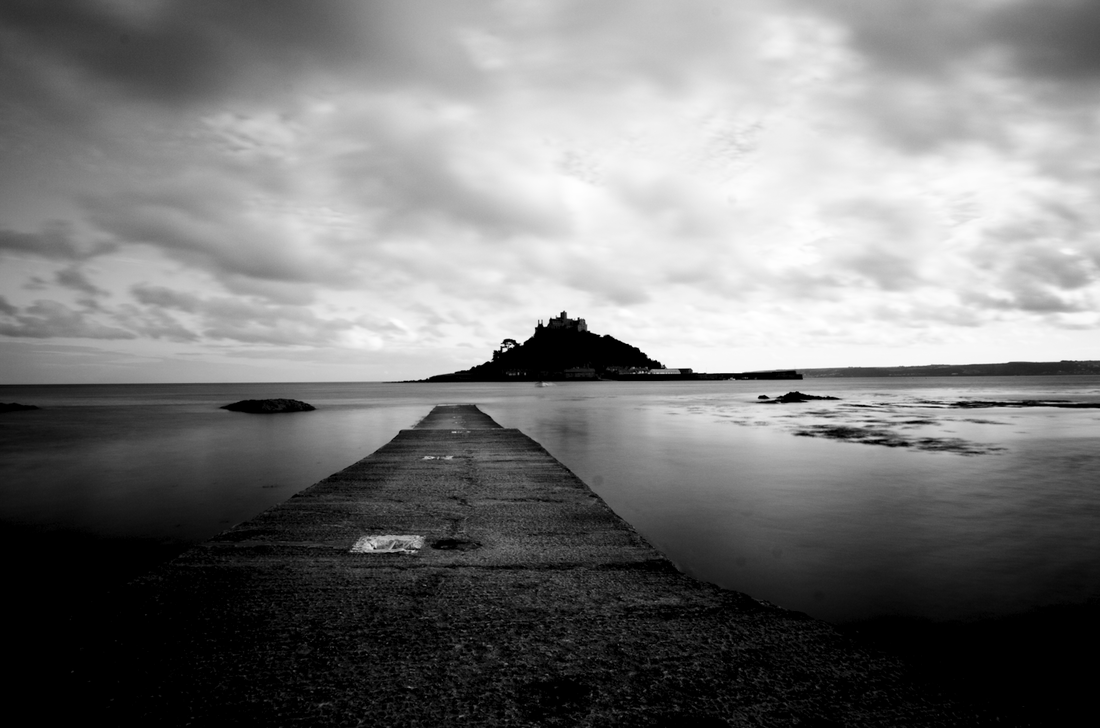
Visiting Godolphin House-- a National Trust property-- near Helston on a rainy morning I did not expect to find a truly inspiring photography exhibition. http://www.nationaltrust.org.uk/godolphin/The hand printed cibachrome images taken by Susanna Heron are simply beautiful , abstract and other -worldly. Taken over a period of 4 years within the confines of her mother’s garden in Penwith they record the inevitable change that takes place through the seasons. The exhibition inspired and intrigued me—landscapes but not of anywhere immediately recognizable. The muted shades and compositions are visually appealing , I want to keep looking at them hence I have ordered a copy of this book from Abe books. Below are two of my images taken on the beach at Marazion later that week inspired by Susanna’s work.
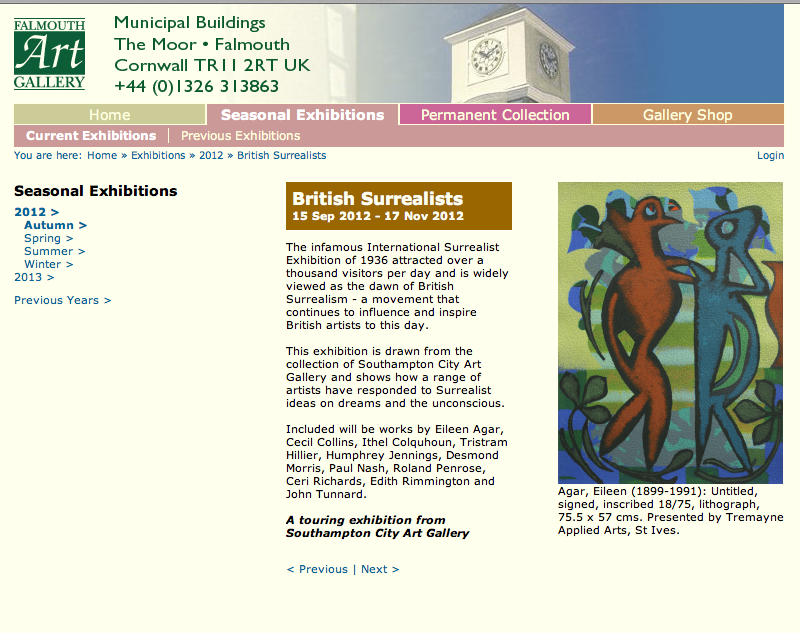
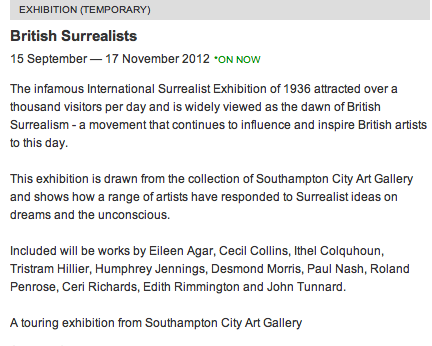
British Surrealists
An intriguing exhibition at Falmouth Art Gallery well worth a visit if you are in Falmouth.
Although not photography based simply looking at the work and how each artist choses to use colour and interpret their thoughts and ideas is fascinating.
I bought The Surrealists in Cornwall Published by Falmouth Art Galley (2010 edition) which contains a range of work by the artists who gathered at Lambe Creek , Cornwall , in the years before the 2nd World War.The catalogue includes captivating images taken by Lee Miller and Roland Penrose.
I was happy to get really positive feedback so promptly from Russell. This assignment turned into a very personal piece of work for me so knowing I produced something that he considers an “excellent submission not only from a technical point of view, where you demonstrate a real understanding and empathy with the form” made the stress and hard work involved worthwhile. This summer has been especially difficult and I have struggled to keep up to date with my OCA work and still have a lot of catching up to do but receiving such encouraging and constructive advice has boosted my enthusiasm to keep on with my studies.
I find printing a black art—I waste masses of paper attempting to get what I feel is a decent print. I use an Epson R2880 and Perma Jet Fibre Base Royal 325 paper. Russell sent me a separate email about my prints and although he comments they are very good he feels they are a touch too contrasty. I personally like high contrast but I can understand what he means as there is some detail lost in a few of the photos. I have noted in my thoughts below which images he suggests reviewing and will re-process and print again to compare.
Individual image feedback & suggestions for improvement.
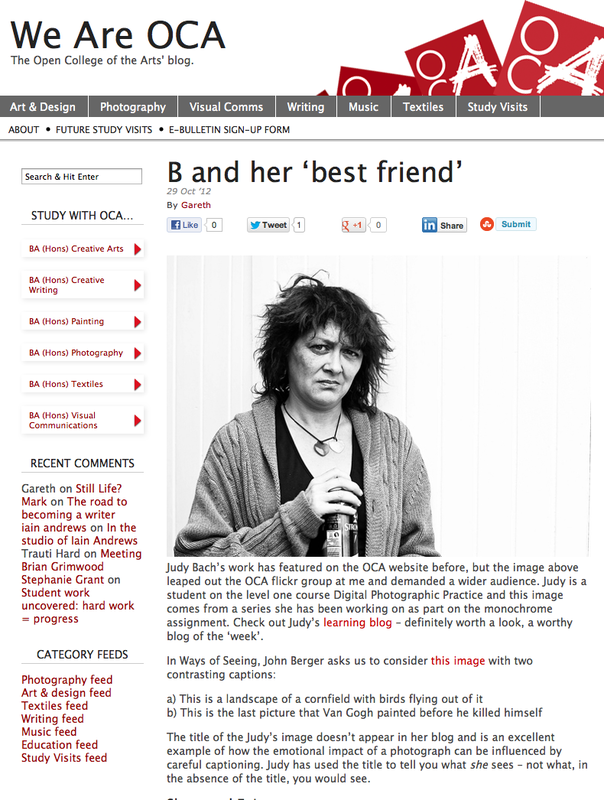
B with her “Best Friend”
The harsh processing and body language “communicate her predicament”
But Russell was able to see beyond this and caught a glimpse of the real B , the one hidden beneath this exterior , “there is a sophistication abut this person that belies her habit”.
I really could not have hoped for a better response to this painful image.
Russell suggests dodging the lower right negative space and also her right hand held against her chest.
I have amended the image as suggested and re-printed it .
Rachel, Summer 2012
Russell suggests that although “the tonal range is good” it might be worth trying to attempt to get some more detail in her hair whilst trying not to increase the contrast or brightness. He also suggests a wider frame or stronger crop. I have amended the image in Lightroom and am really pleased with the resulting print as I have managed to obtain some more detail in her hair. However although I tried a crop of the image I much preferred my original version.
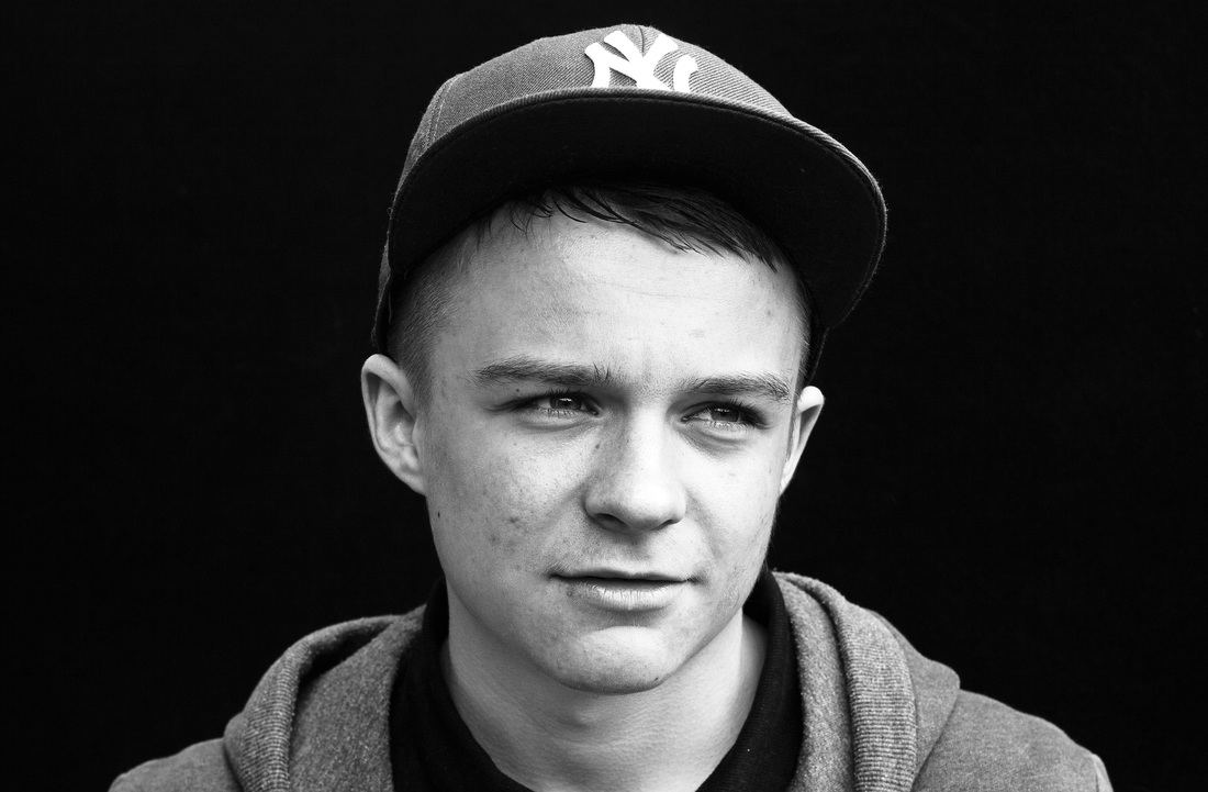
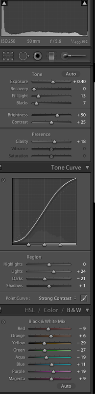
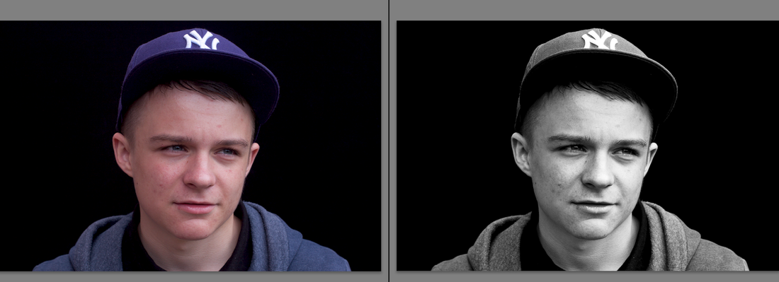
Russell felt my next two images , showing two very different teenage boys , both worked really well.
Jack
“ A lovely portrait , perfectly exposed and converted with a full range of tones and full of detail”
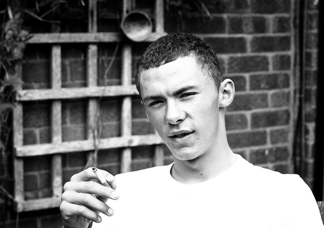
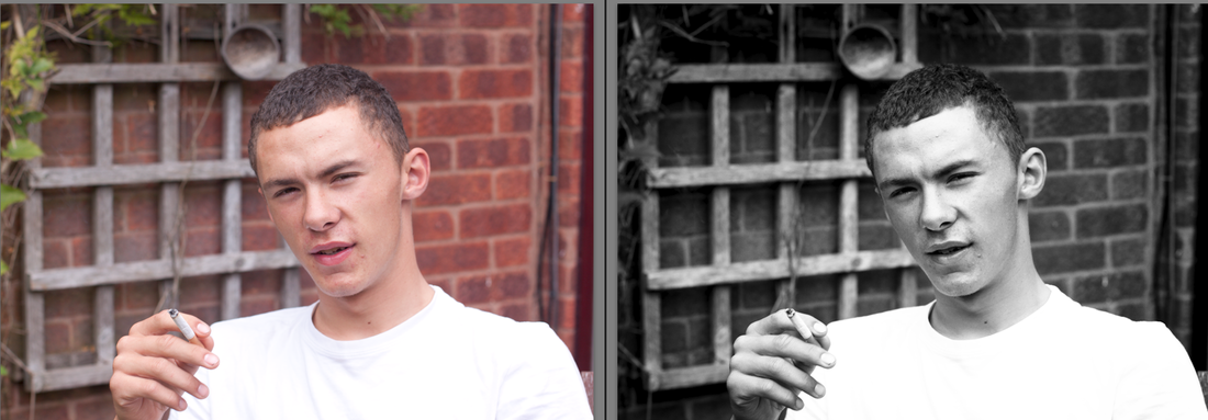
Tom
“ You have again captured the look”
Tom’s T shirt is blown and Russell suggests reducing the brightness and doing a test print to check how it looks.
i have done this and re-printed and have managed to obtain a bit more detail that had been lost , not much but i think the 2nd print is an improvement.
Mum I laughed reading Russell’s comment that his own mother would not allow him to photograph her like this , Mum makes a great model , even if she does not always appreciate the outcome! He suggests once again either a wider or closer shot , I think perhaps a closer shot would be better, I used a white wall as the backdrop instead of my usual black velvet , and agree with Russell just how different the mood is , and also how it draws attention to her eyes. He suggests looking at the work of Richard Avedon, someone whose work I have looked briefly at but not in great detail. I am looking forward to researching his work and will write about this in the reading section of my blog.
I Chose to look the Other way Russell commented this worked worked well within the set capturing mood, texture , tone , and shape, but “shame that its cropped at the top” I couldn’t agree more –oh how hard I tried to get the framing right for this one ! I cannot bear the though of re-taking this again to re-frame (it took about 100 shots) and I no longer have the dress I was wearing that day which was great for capturing texture and tone. Hence unfortunately I shall not be re-doing this particular image !!!
Cousins
This was the least successful image in the assignment and on reflection one I should have perhaps excluded from my final choice. Its really difficult trying to decide which images to include or exclude and as the assignment work was very personal each portrait meant a lot to me , I let my heart rule my head. Russell felt that as the viewer cannot see what the girls are absorbed in the image lacks the “power to draw the viewer”
The print although having a wide range of tones has a “background that loos a bit grey”.
I doubt I will get the opportunity to re-take this image again , additionally it did not fit in with the set but I shall try and remedy the grey background.
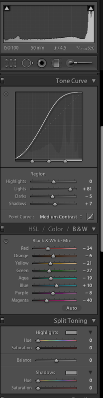
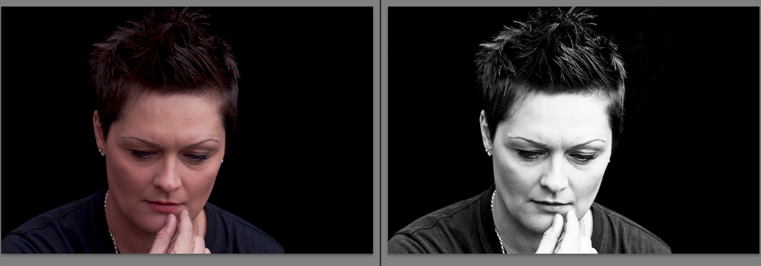
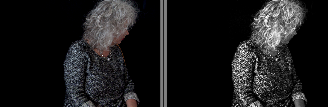
The aim of this assignment is to show the creative effect that makes black and white photography remain relevant and modern. Adjustments made post-shoot alter tones but additionally form, texture, and contrast also need to be considered prior to taking the images and will play an important role is how well the photographs translate from colour to monochrome. I shot this assignment in Raw leaving the WB setting on automatic as I found whilst working through the exercises for part 3 that the WB control in Lightroom can also be used quite effectively to alter colours into tones. I use Lightroom to convert my images to black and white but have no set formula, preferring to tweak until I am happy with the result!
Jane Bown is a photographer I greatly admire and whose work I continually return to look at for inspiration. Her work is exclusively black and white, she comments “ I prefer the simplicity and directness of black and white. It emphasises the underlying patterns of light and dark and confers a natural harmony on the subject. Black and white is quiet, where colour is noisy and distracting, and I feel that it allows the personality of the sitter to come through” Introduction Pg. x Observer Books “Exposures Jane Bown” These are the qualities I aim to show with my latest set of portraits and for my third assignment I have continued with the family portraiture work started for assignment 1.
Brief information about each image is included below but more detailed written notes have sent to my tutor . Some of my written work is quite personal and I prefer to keep this offline.
1.
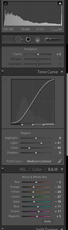
 F4.5 1/160 ISO 100 50mm prime lens
Taken outside using a white shed door as the background.
Custom WB @ 7682 -41 tint.
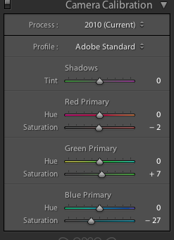
Adobe standard camera calibration setting using LR slider.
+ I stop exposure.
+ 45 Clarity
Tone curve adjustment.
2.
 F5.6 1/400 ISO 100 50mm prime lens
Tripod. Cable release. Daylight outdoors. Black velvet background.
Custom WB @ 5986 + 41 tint.
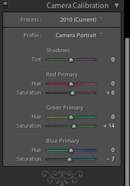
Portrait camera calibration setting using LR slider
+ 30 Clarity adjustment.
+ 1.30 stop exposure.
Tone curve adjustment
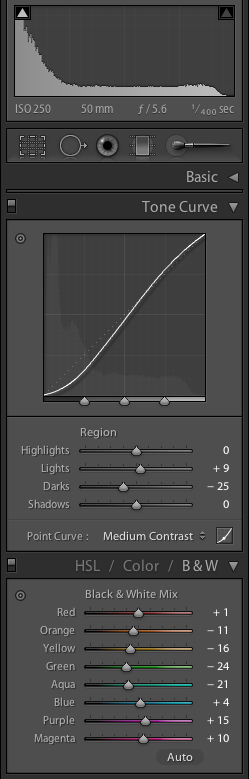
3.
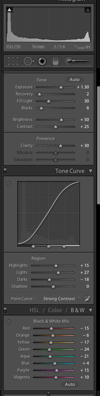
 F5.6 1/400 ISO 250 50mm prime lens
Tripod. Cable release. Daylight outdoors. Black velvet backdrop.
Custom WB @ 5100 + 20 tint.
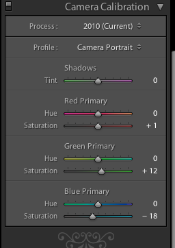
Portrait camera calibration setting using LR slider
+18 Clarity adjustment.
+ 0.40 exposure
Tone curve adjustment.
4.
 F4.5 1/160 ISO 100 50mm prime lens.
Daylight.
Custom WB @ 5278 + 14 tint
Tone curve adjustment.
Portrait camera calibration setting using LR slider
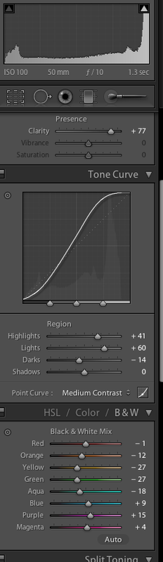
5.
 F10 1.3 sec ISO 100 50mm prime lens
Tripod. Cable release. Light meter.
Indoors using available frontal light from window.
Off white/cream wall as background.
Custom WB @ 5697 + 52 tint.
+ 77 Clarity adjustment
Portrait camera calibration setting using LR slider.
Tone curve adjustment.
6.
 F5.6 1/40 ISO 250 50mm prime lens
Tripod. Cable release. Daylight outdoors.
Black velvet backdrop.
Daylight WB
Portrait camera calibration setting using LR slider.
+ 1.25 exposure
+ 20 Clarity adjustment
Tone curve adjustment.
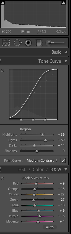
7.
 F4 ½ Sec ISO 200 19mm (using 11-22mm lens).
Tripod. Cable release. Light meter (invaluable for getting exposure correct)
Taken indoors using available side and frontal window light.
Black velvet backdrop.
Custom WB @ 4045 + 147 Tint
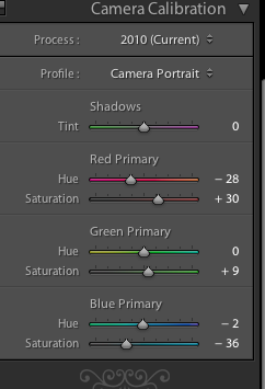
Adobe standard camera calibration setting using LR slider
+59 Clarity adjustment
Tone curve adjustment
8.  F5 1/40 IOS 100 55mm (using 28-75mm lens)
Daylight. Bright sunshine in a shady area of the garden.
Late August.
Custom WB @ 4200 + 22 tint
- 9 Clarity adjustment
Portrait camera calibration setting using LR slider.
Relief !!!!!
Tutor feedback most positive.
I am really happy with my report as I truly struggled with the assignment. It forced me to experiment in an attempt achieve what I , not the camera , envisaged. I approached the assignment thinking no post-processing should be done but looking at a few of my fellow students blogs I notice that a few have done some moderate post-shoot processing.
Backlit images
Moody Blue.
I need to study the difference between printed images and those that will be viewed on a monitor. I love printing my images but am sometimes disappointed when comparing to the screen version, they lack the lustre and illumination. Russell commented on the difference between the screen and printed version , the former much brighter. He commented that I had probably attempted a layers adjustment prior to printing but in actual fact I had not. I re-printed this image after a levels adjustment to compare with the original but was unable to achieve a better print than I already had produced. Something for me to consider in more detail in the future.
Pinhole
Even with the clipped hair Russell found this image “really interesting”
A good point to bear in mind is it is so often easy to become over absorbed in the technical aspect of photography and getting everything technically correct that any creativity can be lost. I think that is why I found this assignment so challenging .
Mum in reflection
“A nice shot” but Russell felt the composition could have been improved by leaving less space between Mum and her reflection. It was difficult to set this shot up and this was the best of the afternoon session. Having an octogenarian model makes it difficult to expect her to pose and change position frequently!
Single light source
The way we were
Russell felt this shot was well composed forming a narrative. He wondered what would happen if I altered the focus to my face not the image. Time allowing I will attempt this but as I am progressing through the course much slower than I anticipated might have to leave this until the end.
Self portrait by Lamplight
Russell felt I captured “a nice mood here” . He felt that by moving the card I used to reflect light next to the camera at an angle would have improved the catch lights in my eye. I have a lot to learn about indoor lighting, preferring to use available light, but it is a skill worth honing.
Bill
I laughed when Russell compared the image of my other half to portraits of Peter Lorre and Bela Lugosi. Although Russell commented the portrait “is a good example of the power of lighting to create mood” he also notes that fill can be used to prevent noise and lift shadow detail. I set my camera to record black and white but was surprised when looking at another DPP Blog that the student had converted to mono post shoot. I would usually do this myself but felt that within the confines of the assignment brief it would be good practice to change my settings pre-shoot, hence I am happy with the outcome .
Dappled light
Russell commented “I certainly think you achieved what you set out to do here”. However I tried to create a narrative without revealing my subjects face which Russell felt“ doesn’t quite work for me” . However he also commented he liked the atmosphere in the shots and suggested “a longer set of images would bring a better sense of place and purpose”. I think this is a perfectly valid point but within the confines of 3 shots this proved rather restrictive.
Mounts Bay
Firstly I must point out all of these images were shot in jpeg so I was a bit confused when reading that ‘the final six images in Raw work very well’ I think the confusion arouse by my comment that I shot in Raw and jpeg combined and would be using the Raw files at a later date for my personal use. That grumble aside I was thrilled with the feedback for the six images submitted .
Exercise: Colours into tones 2
For this exercise I need use the chanel adjustment to create a specific effect: a portrait making the skin lighter but without altering the rest of the tones. I used Lightroom to make my adjustments.
Using the basic conversion the skin is very dull and mid- grey toned.
I increased the red and orange sliders to change the tone of the skin and additionally used a tone curve adjustment to darken the blacks.
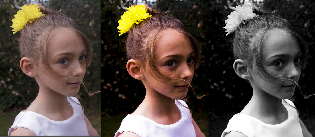
Basic conversion Skin lightened Exercise : Colours into tones 1
For this exercise I need to choose a colourful image with contrasting hues with the aim of creating two different Black and White versions. For one image I need to lighten the grayscale tone of one colour whilst darkening the contrasting tone of the other , and then do the reverse.
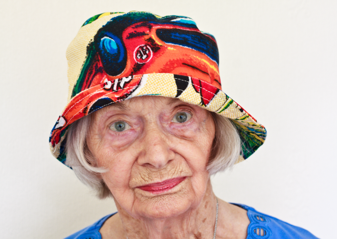
My mum has a rather bizarre collection of hats and I took this image of her wearing one of them , which has bright orange and blue tones , additionally her blue top contrasts well with her lipstick.
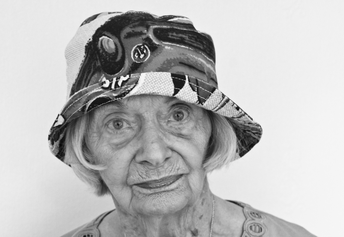
This is the default Black and White conversion using Lightroom.
The skin tones look mid grey -not a really good conversion, the hat is not too bad though.
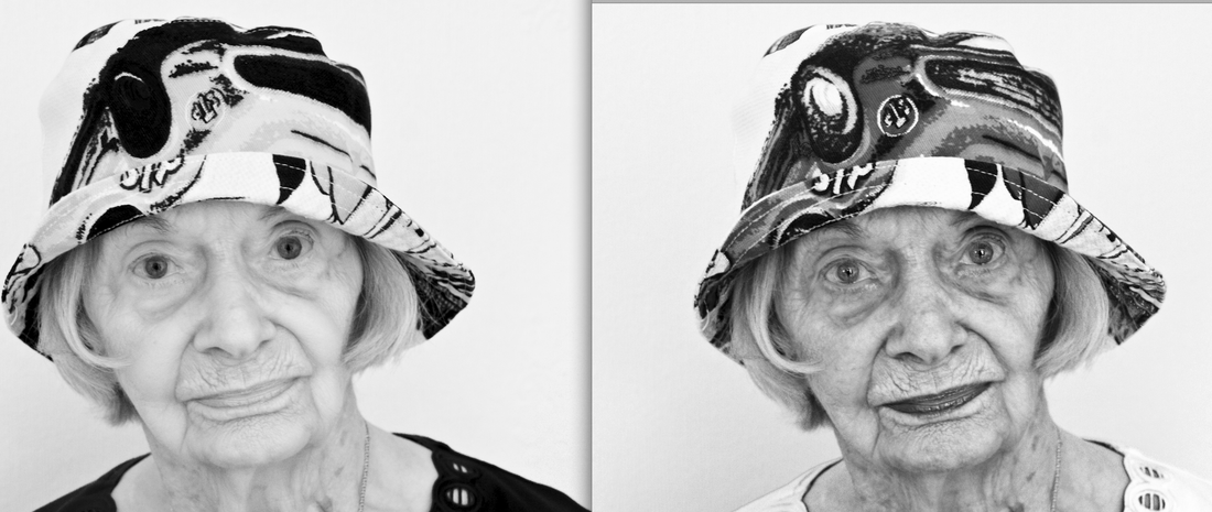
Version 1 Version 2 My first conversion shows the effect of using the Black and White mix slider in Lightroom increasing the saturation of the red, yellow , and orange tones , whilst decreasing blue, purple and magenta. The blue top Mum was wearing has become markedly much darker , black in fact , as have the blue areas of the hat. The orange and yellow colours have become much paler varied tones of grey to almost white—some of the pattern seems to have vanished. This conversion has had a detrimental on the skin tones creating loss of depth and textural detail , her lips have become paler (she was wearing a red/ orange toned lipstick) , creating a rather strange facial appearance.
My second conversion was the reverse making the orange tones darker and the blues lighter. I increased the blue , magenta and purple saturation and decreased the red . Her top is now practically white , her lips and have skin are darker creating a greater range of tonal and textural detail. The hat now has more varied shades of grey from darkish black to light almost white , the pattern completely different.
It is fascinating to see just how much the colour channels can be used to alter the appearance of a Black and White image—that almost sounds like an oxymoron.
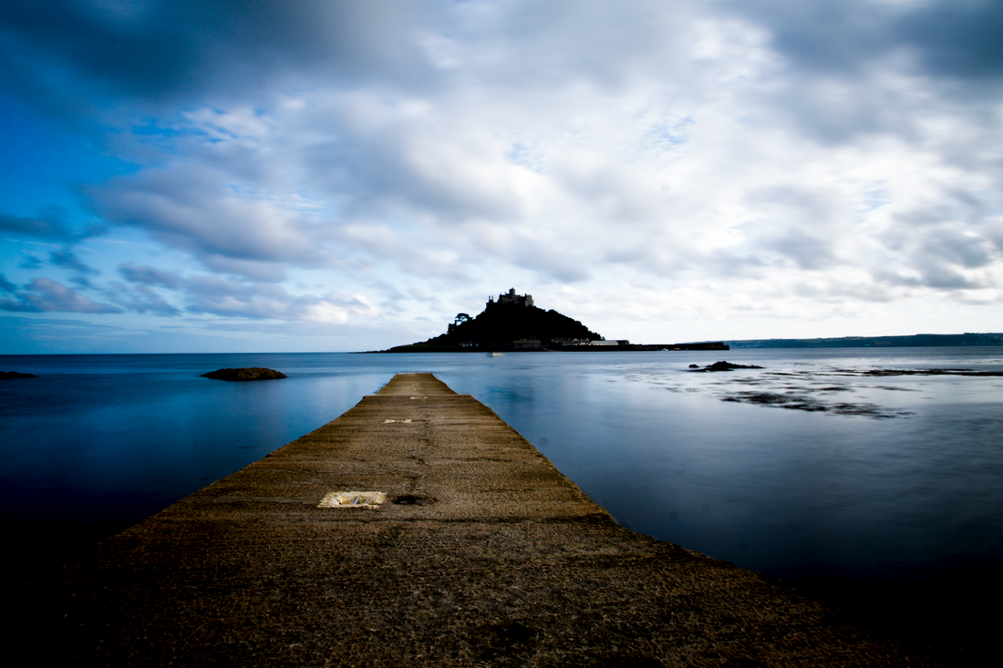
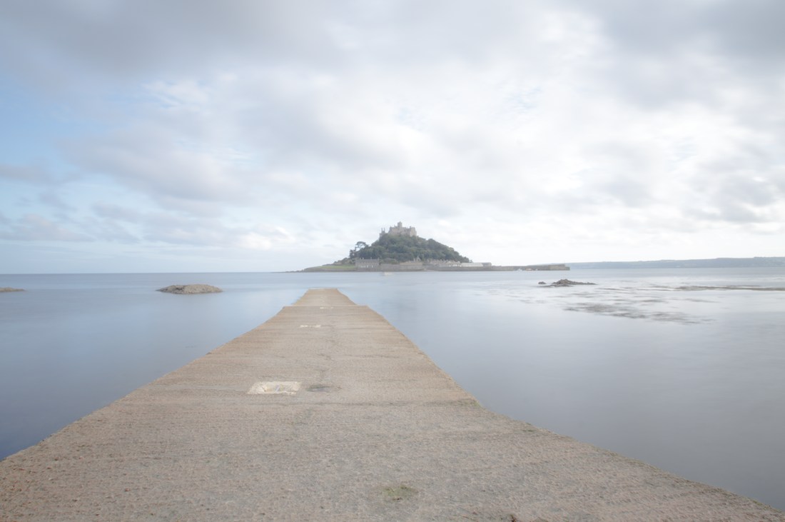
Exercise : Strength of interpretation This exercise looks at the effect aggressive processing has on an image and how it is possible to use it to greater advantage when converting to black and white . I used Lightroom to process each of my chosen images , one portrait and one landscape.
Simply by quite drastically altering the contrast and Curves using the LR tools there is more leeway when processing a black and white image than colour. I attempted an S curve to create greater contrast and as can be seen the hues have become quite garish in both colour versions. In comparison the mono versions (although I find the skin in the portrait perhaps a bit too darkly toned ) are both acceptable. When reversing the process to create a much lighter version once again the black and white images suffer least from the post-processing.
 Original Raw file .
The processing caused clipping in the shadows when I applied an S Curve tone adjustment but this is much less of a problem for the mono version , it creates a dramatic scene. Whilst I prefer the greater contrast of the low key mono version the high key treatment is still perfectly acceptable , how the final image is interpreted is very much a personal choice.
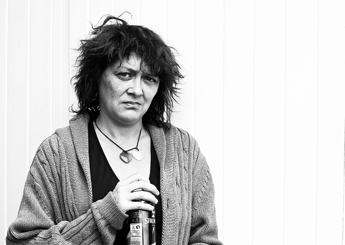
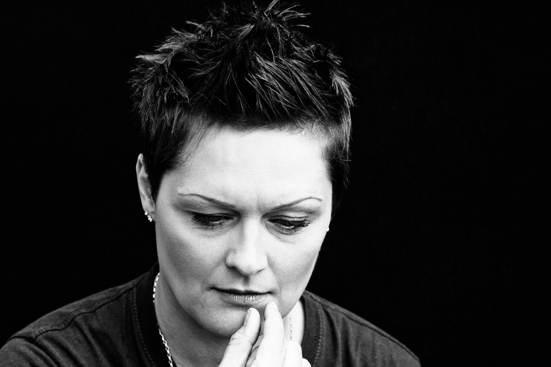
Exercise : Black- and –white
Why is Black and White photography so popular and what makes it so unique? One of my favourite photographers , Jane Bown, works exclusively in black and white, her portraiture is inspirational. She comments “Black and white is quiet , where colour is noisy and distracting, and I feel that it allows the personality of the sitter to come through” Pg. x Introduction Observer Books “ Exposures Jane Bown” , Guardian Books , London 2009. She succinctly describes the great beauty and attraction of black and white photography , stripped of colour black and white imagery relies on tone , texture , shape , and key tones. I frequently convert my portrait shots to mono as I find them visually and aesthetically pleasing. I don’t have a particular method of working but sit and “tweak” the various slider controls--- hue/saturation , tone curves , contrast , clarity etc. until I am happy with the result. Its probably a really haphazard way of working but it suits me .
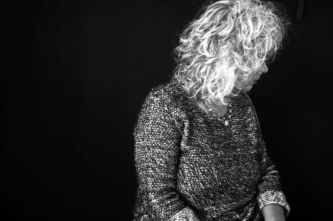
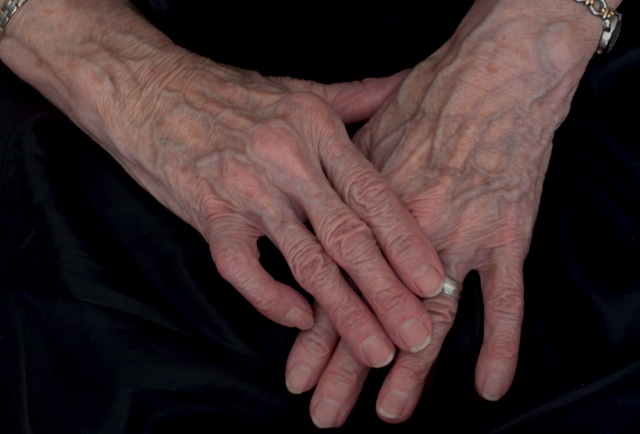
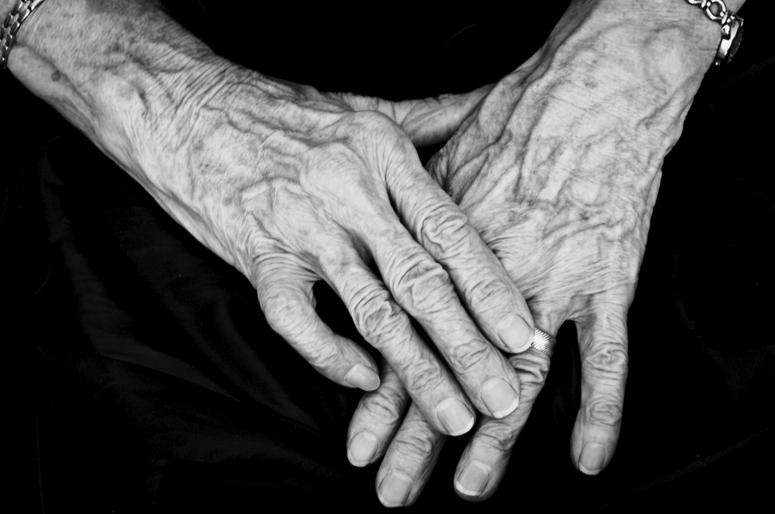
For this exercise I need to think in mono—not something I consciously do when taking photographs. This is an interesting concept as I usually take my shots and decide after shooting which will work better in black and white. I decided to use my long-suffering Mum as a model yet again , but the difference this time was to try and visualize how the tones and textures would look before converting to mono. Having photographed mum lots of times I know that her hair and skin can create great textural detail so important for successful mono conversions. For this exercise I chose to shoot her hands. Old hands , such as mum’s , translate well to black and white.
It was relatively easy to imagine how the image I was going to take would look in mono as she was wearing a black skirt and I asked her to rest her hands on her lap to form a triangular shape. Shape and texture were easy to pre-visualize , the actual skin tones I found a bit more difficult to think about in black and white terms. However I knew her paler skin would provide a good contrast against the dark background. She will not thank me for saying this but I think old hands are so fascinating to photograph , the raised veins and wrinkles seem to become more pronounced when converted to black and white.
Original Raw file below prior to optimising and processing.
Converted to Black & White initially using the Basic conversion button in LR.
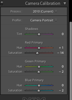
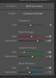
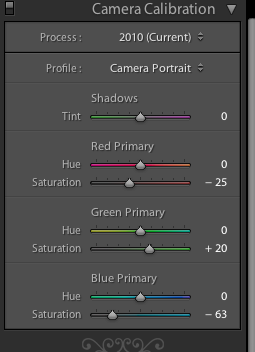
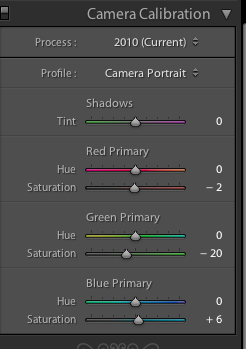
As I have said I do not have a particular method of working and assess each image individually as I process it. I used quite a strong tone curve adjustment , I wanted quite a strong contrast between the dark and light tones. I also experimented with the WB , Camera Calibration and HSL settings tweaking until I was happy with the resulting tones. I also increased the Clarity by + 50. I really feel the final Black and White image has greater visual impact than the original colour version.
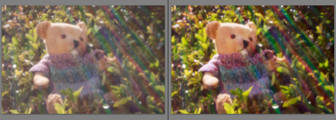
Exercise: Interpretative processing. I need to create three different versions of the same image and decided it would be fun to use one of my pinhole images for this exercise shot in Raw. Using an adapted pinhole lens cap on a digital body is quite a challenge! Unable to look through the viewfinder, the outcome is very hit and miss , but I love the way colour of light is captured and also I feel this type of image is open to various interpretations.
All three images adjusted using Lightroom.
The original Raw image is rather flat and dull in appearance hence for the first version I wanted to create a more a colourful image to really enhance the different colours of light that become visible using the pinhole lens cap.
Steps: Clarity + 18. Vibrance + 29 . Saturation + 5. Tone curve adjustment + 12 lights + 3 darks.
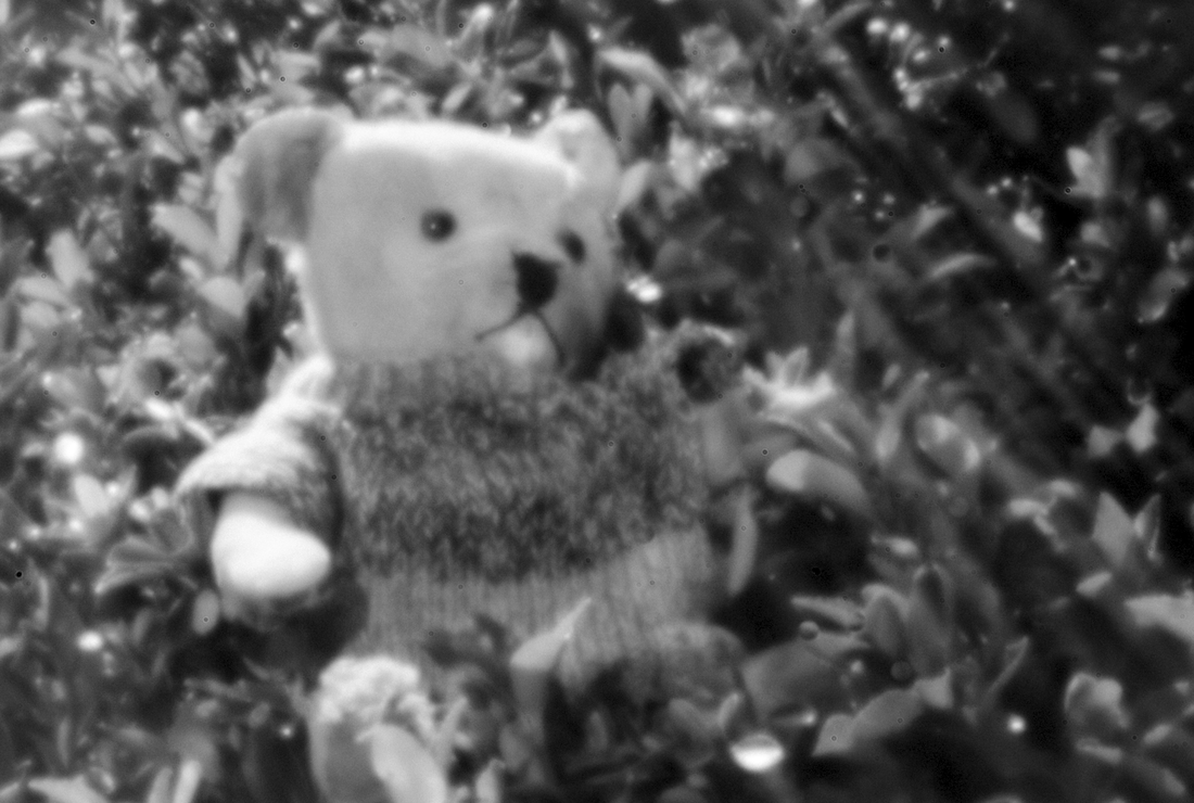
My second version is a black and white conversion starting with the Auto black and white conversion in LR.
The hues become tones ranging from dark to light.
Steps: Convert to mono. + 0.25 exposure . Clarity – 20 . Tone curve adjustment + 40 lights -26 darks. Grain slider + 25.
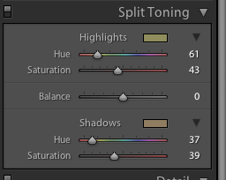
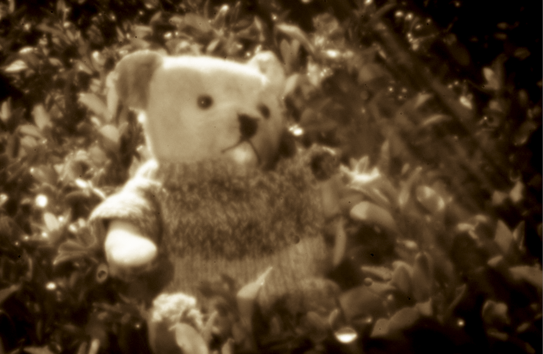
The final version is my favourite, a split toned conversion with the aim of creating the old fashioned , almost antique , appearance of an original pinhole image.
Steps: Convert to Mono. Clarity -17. Tone curve adjustment + 47 lights -5 darks. Grain slider + 22. Post crop vignette -27. Split tone adjustment as below.
I have enjoyed this exercise , there is no limit to creative interpretation, only a personal choice on how far to translate.
|

 RSS Feed